Bubble Plot
The scatter plot can be extended to a bubble plot that is used to look at relationships between three numeric variables instead of two. Each dot in the bubble chart corresponds with a single data point, and the variables’ values for each point are indicated by horizontal position, vertical position, and dot size.
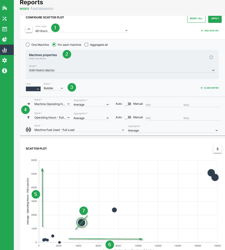
This example shows configuration of a bubble chart:
| # | Description |
|---|---|
| 1 | Time range selection. |
| 2 | Selection of a specific machine(s), machines of a certain model and optional aggregation of entire data set. |
| 3 | Color and shape of the marker |
| 4 | Signal selection |
| 5 | Machine Operating Hours - Full Load. Represented by the location of the dot on the vertical axis. |
| 6 | Machine Operating Hours Total. Represented by the location of the dot on the horizontal axis. |
| 7 | Machine Fuel Used - Full Load. Represented by the dot size. |
Additional Functionality
- The chart can be downloaded in various image formats or exported to raw data as shown.
- A slider bar allows the user to zoom in and out of the Scatter Plot or select a specific segment of the data-set to visualise.