Slices
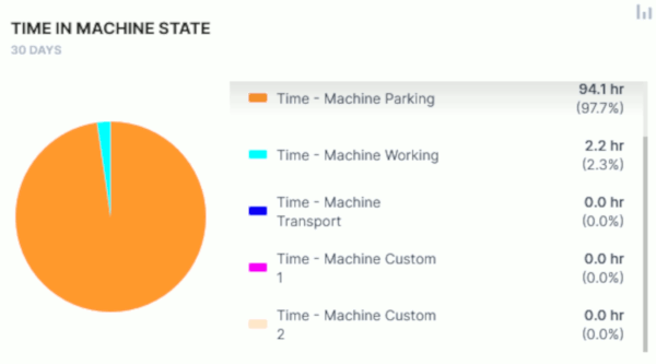
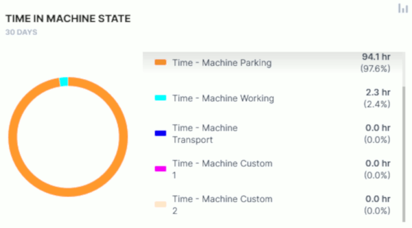
The Slices widget allows you to monitor several signal levels or usage for a specific period of time in form of a Donut or Pie chart.
Configuration
Configure the widget and put it on the Organization Dashboard and/or the Model Dashboard by following the steps below:
It is highly recommended to adapt a Machine Page (Model Dashboard) centrally via the Machine Page Layout. If you need to configure the Machine Page for the selected machine only, proceed as follows:
-
In the selected Machine Page, select Manage Layout > Add widgets.
-
Select the desired widget. A preview will be shown.
-
Click Apply. This forwards you to the widget configuration dialog with the options described below.
If you need to adapt the Organization Dashboard, select the desired dashboard configuration and click Edit > Add  to open the widgets catalog, see also Add Widgets to the Organization Dashboard.
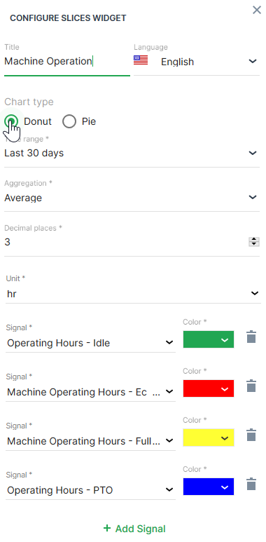
| Item | Description |
|---|---|
| Title | The label for the widget (English is the default, additional languages must be configured. See Language below). |
| Language | Select the language for the title of the widget. |
| Model | Model name |
| Machine | Machine name |
| Chart type | Select either Donut or Pie chart. |
| Time | Select a predefined, relative time range, e.g. Last 24 hours or select a custom one, e.g. This last 5 Days, see Time selection. |
| Aggregation | The value returned for the signal, calculated using all the measurements within each Bucket. |
| Decimal places | Select the number of decimal places for the value. |
| Units | Entity used for measurement such as V (voltage), % (percentage) and so on. |
| Signal | Select the signal to be displayed. |
| Color | Select the color to represent the signal in the chart. |
Sample
Suggested Usage: Use it for multiple signals that sum up to a total.