DataPortal Quick Start
Get Started
The Proemion DataPortal is a platform to manage your fleet of telematics-equipped machines. This guide is for new users who want to get started immediately using this feature-rich application. In these pages you will find an introduction to the following functionality:
-
Dashboard for an overview of your fleet
-
Machines overview and details
-
Highly configurable real-time reporting tools and widgets
-
Layout customization of your DataPortal with just a few clicks
General
Login Page
To sign in to the DataPortal, proceed as follows:
-
Open a web browser and go to DataPortal.
-
Enter your Username and Password.
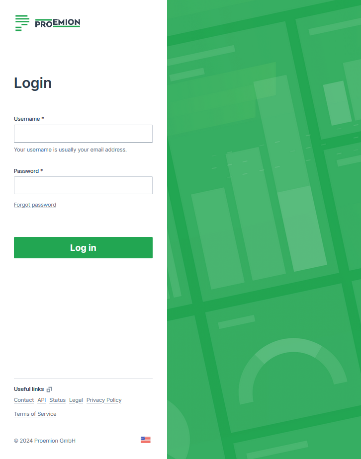
Figure 1: Enter your Username and Password -
Select Log in
If you enter an incorrect password multiple times, the login screen may be temporarily locked. If you forgot your password, see Password Reset.
You can change the language in the footer. The Login page can be customized in Themes.
The default URL for the Proemion login page is https://dataportal.proemion.com/.
If you use an OEM-branded access to the DataPortal, use the URL provided by your OEM.
Usernames for DataPortal are not case-sensitive.
Sign out behaviour
When users sign out of the DataPortal:
- The user´s session ends.
- The user is returned to the login page.
- No redirect to an external URL occurs.
Alias Email
For the email address, usually used as the username, it is allowed to use email subaddresses, provided that your email provider supports it. By that, you can have multiple accounts with 1 email address, e.g. myemail+machine-owner@oem-mail.com.
This feature supports Dealers that work on multiple OEMs; there might be many users that need multiple emails to log in to different OEMs' DataPlatform accounts. It can also help a single OEM's user to create test users for different organization unit types or even subcustomers, e.g. myemail+dealer@oem-mail.com, myemail+customer-a@oem-mail.com.
Alternative method for alias email
If the method described above does not work, consider the following option to make it work:
Use machine-owner+myemail@oem-mail.com, instead of myemail+machine-owner@oem-mail.com.
Some providers require the alias directly before the @ symbol, i.e. "current-username+alias@oem-mail.com". For concrete examples, see the following list:
-
Gmail (Google): Format:
username+alias@gmail.com-
You do not need to create a new email or user to receive these emails to your primary Gmail account.
-
You may need to create an official alias within Gmail to reply FROM your account without exposing your actual Gmail address.
-
-
Microsoft: Format:
username+alias@domain.comfor Outlook services (such as Live.com, Outlook.com and possibly more)- You may need to create an official alias within Outlook to reply FROM your account without exposing your actual Outlook address.
-
Proton Mail (proton.me): Format:
username+alias@proton.me
The use of the "+" symbol in email addresses, often referred to as "plus addressing" or "subaddressing," is described in RFC 5233 "Sieve Email Filtering: Subaddress Extension" and RFC 5321 "SMTP" section 4.5.1. Between RFC 5321 SMTP and RFC 5233 Sieve Email Filtering: Subaddress Extensions, the lack of a universal standard allows providers to interpret placement individually, leading to variations in how subaddressing is implemented across different email systems.
Password Policy
New users are asked to create a new password with the following criteria:
The password must have:
-
Min 12 characters.
-
Max 64 characters. Any character is allowed.
-
Different from username or email.
-
Max 2 consecutive characters.
Password Reset
Users can reset their password by selecting the Forgot password link. You are then prompted to enter the account email address and a link to change the password will be sent. Enter your new password according to the Password Policy.
Note
The link for the password reset is valid for 10 minutes.
Search
The DataPortal includes a search field that allows you to perform a single-click global search for the following objects:
-
Machines (machine name or IMEI number of CU)
-
Vehicle identification number (VIN)
-
Product Identification Number (PIN)
-
Serial number
-
Users*
-
Organizations* (a search by Organization Type is also possible)
-
Models*
Note
*Searching users, organizations and models is only possible from the Administration panel.
By entering a search term in the field, an autocomplete results window will appear as long as there is a match
Selecting an entry from the results forwards you to the Machine Page for the communication unit.
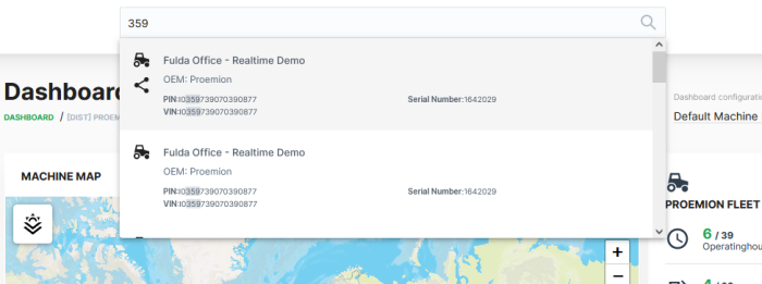
In the list of results that appears, the matches are displayed in bold.
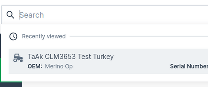
Recent Search
Opening the search field without performing a specific search shows you the three last recently viewed machines in the search results:
Search within Map
You have the possibility to search directly within maps.
When you type in a specific name of a location, the map will be zoomed to this location while showing the machines within this location.
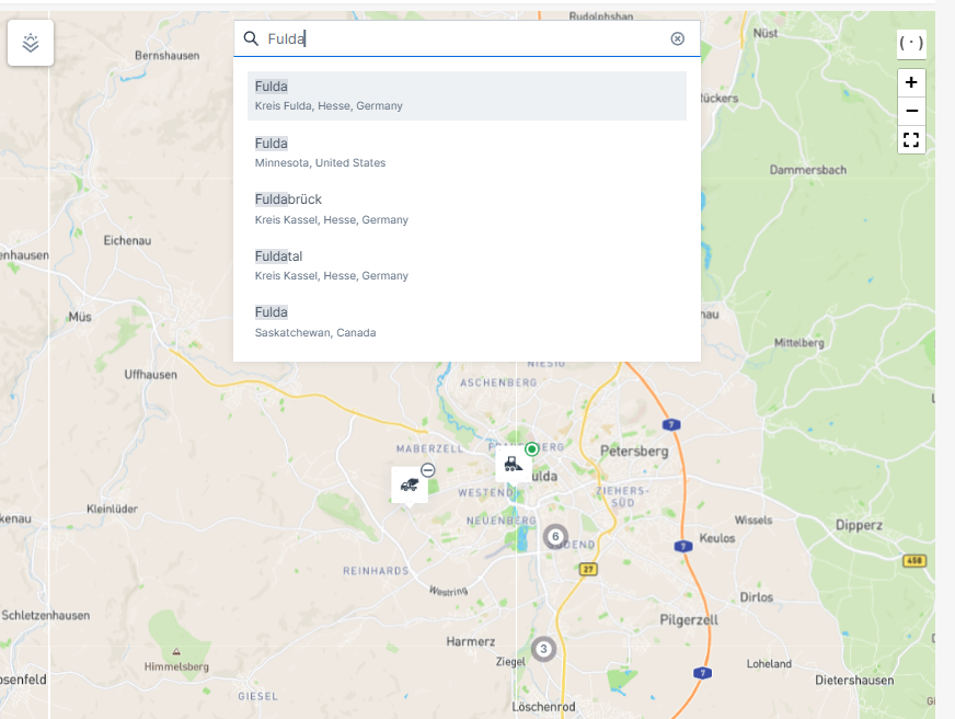
Table Options
Tables are used to represent data in several menus and elements of the DataPortal. Within these tables you have different options to view, search or filter data:
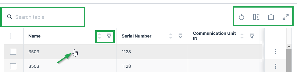
Each row is clickable and leads you to the details of the machine. You can search throughout the table or specific columns, see below.
Sort and Filter Table
-
 Reset all options to default values.
 -
 You can remove or add each column from the table.
 -
 You can sort by each column in the table by selecting the arrows above the column.
 -
 Via the 3-dots icon by the end of each row, you find further actions and options in the drop-down menu, see Machines Overview for an example of available options.
 -
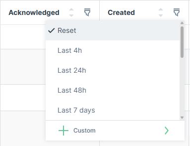
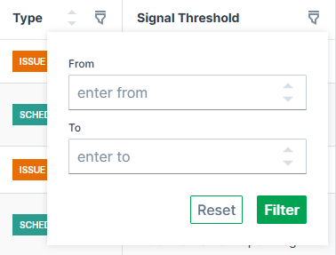
 Filter and search of specific columns are available by clicking the filter icon and entering the searched text into the fields at the top of each column.
For date columns, the filter offers relative time presets (e.g. Last 4h, Last 24h, Last 48h, Last 7 days) or a Custom option to define a specific date-time range.
For number columns, the filter offers a numeric range with From and To input fields.
Resize Columns
Columns can be resized by dragging the handle at the right edge of the column, which shows a double-headed arrow icon with two vertical lines in the middle, see screenshot below:
![]()
Any columns resized by the user are saved locally and restored when reopening the table.
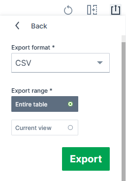
Export Table
![]() Via the export icon, tables can be exported.
Via the export icon, tables can be exported.
You can select to export all columns or only specific columns as viewed in the DataPortal:
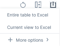
You can select to export the tables mostly as a CSV, JSON or XLSX file and PDF file:
Depending on the exported table, the column headers include the units (for the "Signal" column) and the time zone GMT+0:00 (for the "Last updated" column).
Important note on rounding
Consider that due to rounding, the displayed values in tables and charts may differ slightly from the underlying data.
Therefore, refer to the raw data displayed in the exports for exact figures of a report (instead of, for example, summing up the values displayed in a chart) as the values are displayed in full precision.
Note that in the XLSX exports, 3 decimals at maximum are displayed by default, yet the full precision raw value remains.
Dashboards
Introduction
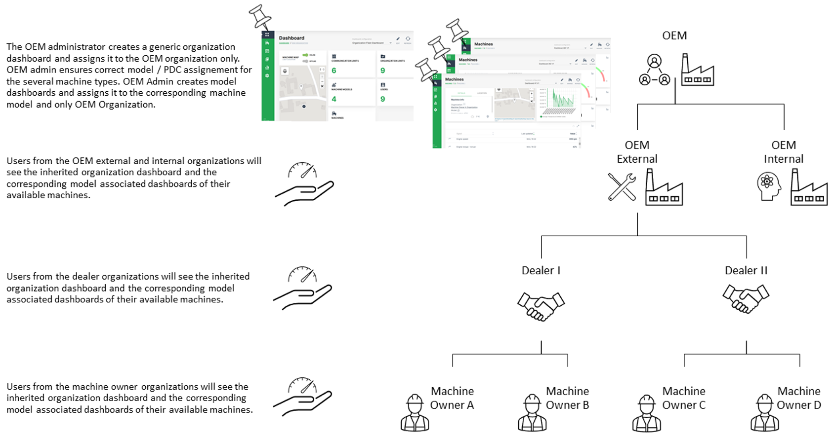
In the DataPortal there are two different types of dashboards available for customization with an individual widget layout. The organization associated dashboard provides an overview of your machine fleet and data on an organizational level. A model associated dashboard can be configured to display specific signals and states for a certain machine and its corresponding model when opening the machine page. For both types of dashboards, the same set of widgets is available for configuration of a customized widget layout.
Since there are certain rules for displaying the several dashboards, it is essential to distinguish between organization associated dashboard and model associated dashboard. The basic idea of an organization associated dashboard is to show the most relevant parameters for the entire fleet and organization. The model associated dashboard is aimed to show machine and machine model specific data. Please be aware that the organization associated dashboard is bound to an organization and a model associated dashboard is bound to the organization type.
Especially when having a rather complex organization tree and a fleet with different machine types and models, the assignment of a dashboard to the organization and model has an important role for the visibility down to the machine owner organization through the entire organization tree.
Recommendations for handling of organization associated dashboards:
-
It is highly recommended for organization associated dashboards to just assign it to the top level organization and leave the organization units below unchecked. The lower level organizations will automatically inherit the organization associated dashboard from their parent account then.
-
Since the management of multiple dashboards requires additional administration efforts at the lower level organization units, it is also recommended to keep the organization associated dashboard as generic as possible. So it can be used for all available types of accounts.
Recommendations for handling of model associated dashboards:
- Create a basic dashboard layout for one model and assign it to other models or and duplicate it for configuring different dashboards layouts.
INFORMATION
As of January 2023, model associated dashboards are assigned to the organization type, e.g. OEM or Dealer, and not the organization (unit) itself. Thereby, all organizations (and their organization units) of that organization type inherit the layout of the model associated dashboards.
Note
INFORMATION A video tutorial on how to create and assign a customized dashboard for the lower level organization units can be downloaded at the following link Dashboard Management Part 1. In case that an updated version of the dashboard needs to be pushed to the lower level organization units, please refer to Dashboard Management Part 2.
Organization Dashboard
The organization associated dashboard displays the required datasets and information for the entire organization. Depending on user permission sets, users are able to adjust the layout of this page, see Dashboard Page Layout.
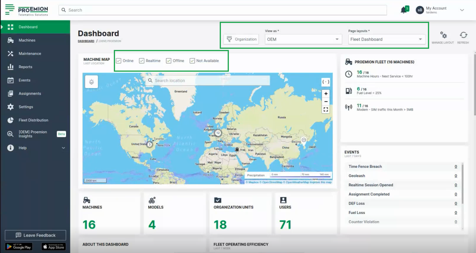
Consider to activate the filters shown above the map for displaying machines in the map that are:
- Online
- Realtime (having a Realtime session)
- Offline
- Not available (for 3rd party machines, i.e. none CANlink® mobile machines)
Organizations
An organization comprises groups of users in hierarchical org units that carry out management tasks. The highest rank in the hierarchy is the distributor level org unit that has visibility of the entire organization. The distributor creates and performs administrative functions for child org units. Generally an organization manages machine models, machines, data and objects such as reports and widgets. The primary org unit types are:
| Classification | Visibility | Description |
|---|---|---|
| Distributor | manufacturer (OEM), dealer, machine owner | Provides telematics devices, services, 1st-level support and escalation to 2nd-level support. |
| OEM | Dealer, machine owner | Machine/equipment manufacturer. |
| Dealer | Machine owner | Provides machines including customer service to end-customers. |
| Machine Owner | Operators and machines | Owner/operator of the machine in operation. |
Org unit members can view child org units but not parent or sister org units.
Org units contain users, models, machines and communication units. Users are assigned entitlements or permissions that allow them to perform functions, manage users, data and machines.
The primary roles are "Admin" and "Maintainer, see Permission levels.
The Admin is responsible for creating the structure of the organization (creating org units, models, widgets) including configuring permissions for Maintainers.
The Maintainer is responsible for managing models, widget layouts, machines and users in org units.
Filter by Organizations
As the Organization Dashboard shows data in the widgets of the entire organization tree, you can filter the dashboard by the organization units for your individual view in the DataPortal. This can be done for every dashboard configuration.
To filter the dashboards, proceed as follows:
-
In the Dashboard menu, open to the Organizations drop-down.
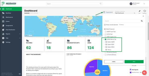
Figure 2: Organization associated Dashboard - Organizations Filter -
Select the organizations that you want to view their data in the dashboard (widgets). When selecting an organization (parent), all its children organizations are selected, too, and will be greyed out. This means that all widgets will fetch information for the selected organization together with its children.
-
As a result, the dashboard shows data only from the selected organizations. An icon will be displayed in the widgets that show the filtered data.
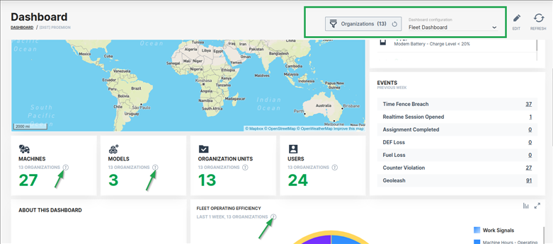
Note
The filter criteria are preserved when switching between dashboards during a session in the DataPortal.
Filter by View
You can filter the organization dashboard by an organization type for your individual view. That means, selecting this filter changes your view of the organization dashboard to the one of either an OEM, Dealer or Machine Owner.
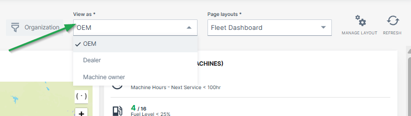
To define organization types for each organization dashboard, go to Visibility level/Binding in the Dashboard Page Layout
Filter by Page Layout
It is also possible to create and save multiple organization dashboards/layouts that display different widgets and/or time range.
In this case, the desired organization dashboard must be selected from the drop-down menu:
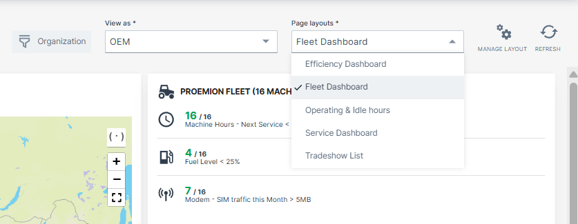
To define different layouts of organization dashboards, go to Duplicate/Create Layout in the Dashboard Page Layout
The model associated dashboard displays the required datasets and information for specific machine models and herewith for all machines which are assigned to this model. The dashboard is displayed in a dedicated Machine Page for each machine belonging to this model.
A user viewing a machine page gets a widget layout based on the template assigned to the model of the machine. Depending on user permission sets, users are able to adjust the layout of this page.
Machines
Machines Overview
Machines Overview
The Machines Overview is the central place for managing specific machines on different views.
The machines can be displayed in map that allows to zoom-in and-out and gives a quick description of the machines whn hovering over.
The machines can be also displayed in a table/list view to have a clear structure of the available machines.
By default, the Machines overview offers the 3 views: List view, Map view and Split view on all machines visible to the user. You can disable the possibility to select the Map view via Settings > Portal Appearance > Theme > Behavior Options.
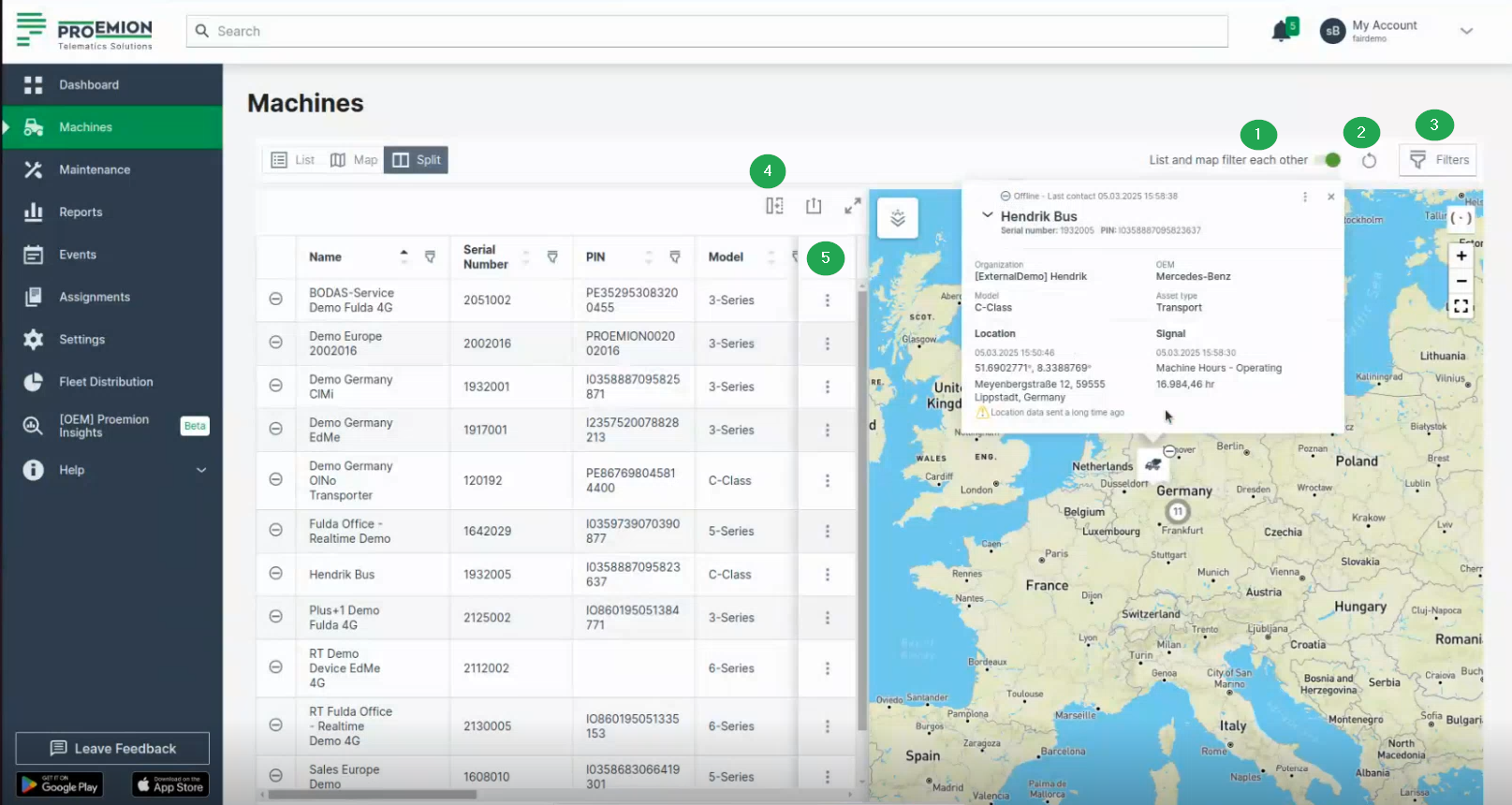
The filters are offered for both map and list view to display only the desired machines, e.g. online/offline, filter by certain states, etc., see the following filters and options:
- (1) List and map filter each other
- (2) Reset icon
- (3) Filters
- (4) Table options (available for the list view only)
- (5) 3-dots (available for the list view only)
Options & Filters
(1) List and map filter each other
The "List and map filter each other" option is to be found on the Machines Overview.
Active by default.
By switching off this option, the map and list are not linked and can be used independently. That means, you can filter the list by its columns, but the map won't be filtered by the machines filtered in the list; or you can zoom in the map, but the list won't be filtered by the machines visible on the map.
(2) Reset icon
The "Reset" icon/option is to be found on the Machines Overview.
Use the Reset icon to globally reset both Map and List views to default state or to reset filters only.
(3) Filters
The filters are to be found on the Machines Overview

Filter the machines in both the map and list view simultaneously by the following options:
-
Connection status, e.g. online status. Includes devices with <
>. -
Maintenance status, e.g. upcoming and/or overdue maintenance statuses. When selecting the Maintenance filter, the icons of the machines change in the map dependent on their maintenance status, e.g. "Upcoming" icon:
 or "Completed last week" icon:
  , etc.
Figure 2: upcoming icon -
Asset types; filter by the asset types assigned to the models.
(4) Table options
The table options are to be found on the Machines Overview.

Adapt the list and export it, see also Table Options.
The options regarding the table are available in List and Split view only.
(5) 3-dots
The 3-dots are to be found on the Machines Overview.
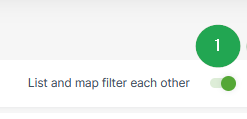
The drop-down menu can be opened via the 3-dots by the end of each row in both the List and Map views and offers the following options:
-
Go to Machine Page
-
Go to Maintenance Task (only in Map view; if the maintenance filter is applied).
-
Open Signals Overview Panel.
-
Show machine on map (only in List view) Zooms to the location of the machine on the map. This is option is useful when the option List and map filter each other is deselected (see (1) in Machines Overview).
-
Open in Google Maps. Opens Google Maps in a new tab with the static location/coordinates of the machine.
Tip
All filters and options applied (apart from visible columns) will be included in the URL.
Copy & Share location
The following location-related options can be used with permission set Location:Latest.
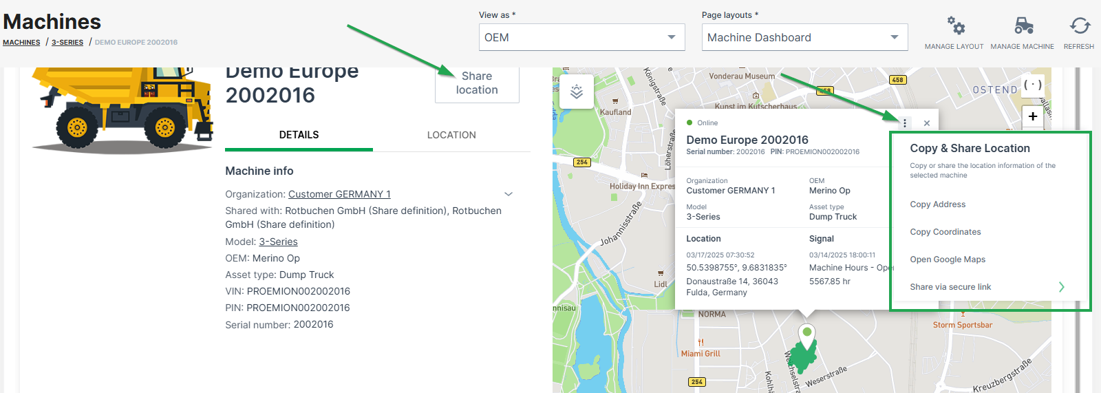
Copy address
Copies the machine address at the time the link was created, i.e. street name and number, zip code and city.
Copy coordinates
Copies the latitude and longitudes coordinates of the machine at the time the link was created.
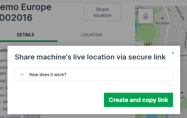
Share static location and Share live location
The permission set Location:History is required instead Location:Latest to enable the following links.
-
Create a link to a web page/view on the static machine location at the time the link was created, or
-
Create a link to the live machine location.
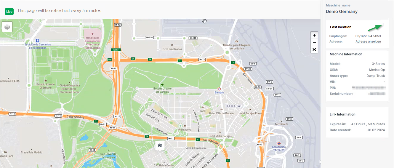
The machine's live location is updated every 5 minutes by default as long as the link is valid, but stops the refresh if the machine is idling for 1 hour.
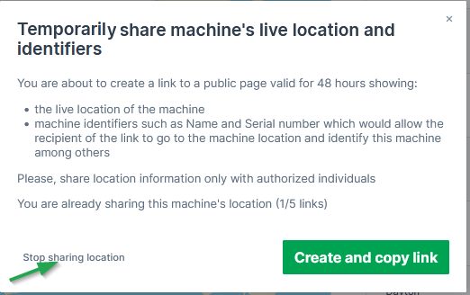
The links are accessible by users without DataPortal account and is valid for 48 hours. The number of shared links is displayed in the share dialog.
Note
A maximum of 5 links can be shared.
To create a shareable link, proceed as follows:
- Click Share location or the 3-dots in the map.
- Choose Share via secure link:
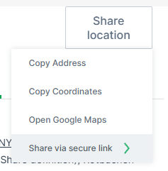
- Choose either Share static location and Share live location.
- Confirm with Create and copy link:
The link will be copied to the clipboard.
The shared page looks as follows:
Note
Note that the page is displayed in the language of the browser when not logged in, otherwise it displays in the selected DataPortal language.
Note
You can open the live location in Google Maps via the 3-dots, see also (5) 3-dots.
Stop sharing location
You may stop the sharing of the location via the share dialog again. Consider the note:
Map
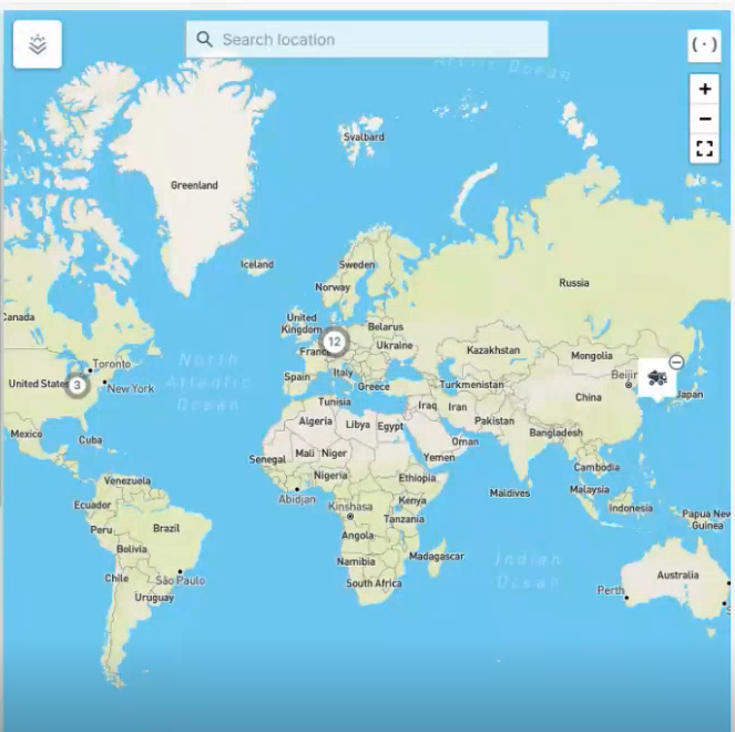
The map in the Machines Overview shows the most recent recorded positions of all machines. Machines that are located in close proximity to one another are grouped together and identified by a cluster symbol. Zooming in or selecting the symbol shows each individual machine.
Hovering over a machine on the map displays a pop-up with basic details for online and offline (showing "Last contact") machines:
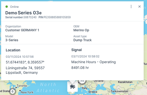
Selecting the machine icon shows the view with the following details:
Note
You can view the map elements like country-, city names, etc. translated as per the language set in your account preferences.
Supported languages: English (also fallback language), German, French, Italian, Spanish, Korean, Japanese
-
Current connection status (online or Last contact (offline) 1)
-
Machine Name
-
Serial number/PIN
-
Organization
-
OEM name
-
Model
-
Asset type; if there is no asset type assigned to this model, the organization unit name is displayed instead
-
Location together with its last datapoint1
-
Signal (e.g. operating hours)
-
Date and time of the most recent status change
-
Maintenance status (if the maintenance filter is applied)
-
- Last contact shows the timestamp of the last time the CU contacted the DataPlatform, i.e. went online.
- Last datapoint shows the timestamp of the last datapoint, i.e. transmitted files or received machine signals, e.g. engine or location data. Note that certain signals don't update the Last Datapoint, see Proemion Standard Metrics → "Standard System Metrics".
List
The machine list in the Machines Overview displays the following parameters in different columns:
-
Online state
-
Name
- VIN
- PIN
- Serial Number
- Model name
-
Organization unit name
-
Last contact1
-
Last datapoint1
- Maintenance Tasks status ("Upcoming", "Overdue", "Skipped last week", "Completed last week")
-
Asset type
-
Data Source (shows the CU type, CU model, and import source for identifying the machine data source, e.g. "Hardware Proemion CANlink mobile 3600")
-
By the end of each row, you find the drop-down menu via the three-dots with links as described in Machines Overview2.
For information on how to adapt or export the table view, see Table Options.
Note
Note that all columns will be exported.
-
Last contact shows the timestamp of the last time the CU contacted the DataPlatform, i.e. went online. Last datapoint shows the timestamp of the last datapoint, i.e. transmitted files or received machine signals, e.g. engine or location data. Note that certain signals don't update the Last Datapoint, see Proemion Standard Metrics → "Standard System Metrics". ↩↩
-
You can open the Machine Page by selecting an entry in the list or selecting the 3-dots by the end of the line of each machine. ↩
Signal Overview Panel
The Signals Overview Panel provides a quick overview of the machine’s current state and key measurements. It allows users to monitor real-time signals and assess the operational condition of the selected machine at a glance.
To open the Signals Overview Panel, you have two options:
-
In the Machine List, select the row of the desired machine.
-
In the Machines Overview, open the 3-dots menu at the end of the machine's row and select the option Open signal overview panel.
This will display detailed signal data for the selected machine in a sidebar panel on the right side of the DataPortal, see following Screenshot.
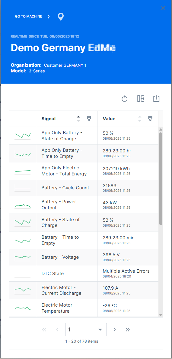
General machine information is displayed at the top of the panel:
-
Online / Offline state
-
gray background color indicates currently offline.
-
green or blue background color indicates currently online.
-
-
Time of most recent state change
-
Machine Name
-
Organization the machine belongs to
Click on GO TO MACHINE to open the Machine Page.
Click on the marker icon ![]() to zoom the map to the machine.
to zoom the map to the machine.
Machine Quick Look
The Machine Quick Look is an enhanced view in the sidebar on the most frequently requested signal reports and machine activities like operating hours and/or ignition state and also shows the machine properties.
The Machine Quick Look provides trends and summaries of the selected machine in addition to the latest values shown in the (Signal) List.
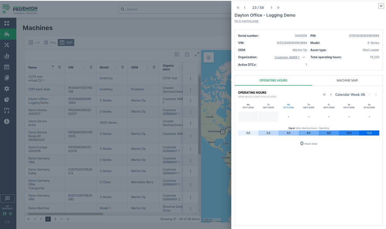
To open the Machine Quick Look sidebar, go to Machines Overview:
-
At the end of the line of the desired machine in the List view, you can select image:
> "Open machine quick look panel":
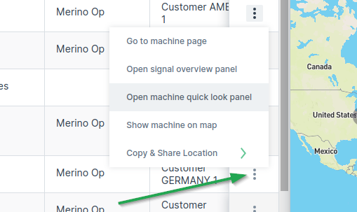
Figure 2: 3-dots -
You can also open the Machine Quick Look panel from the new quick look preview button when you hover over a machine row:
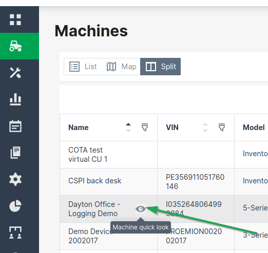
Figure 3: Machine Quick Look - Hover -
On the Map, find the desired machine and open the Machine Quick Look panel from the machine map tooltip.
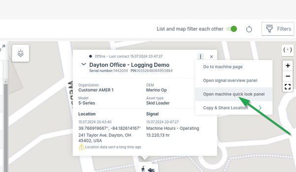
Figure 4: Machine Quick Look - Map
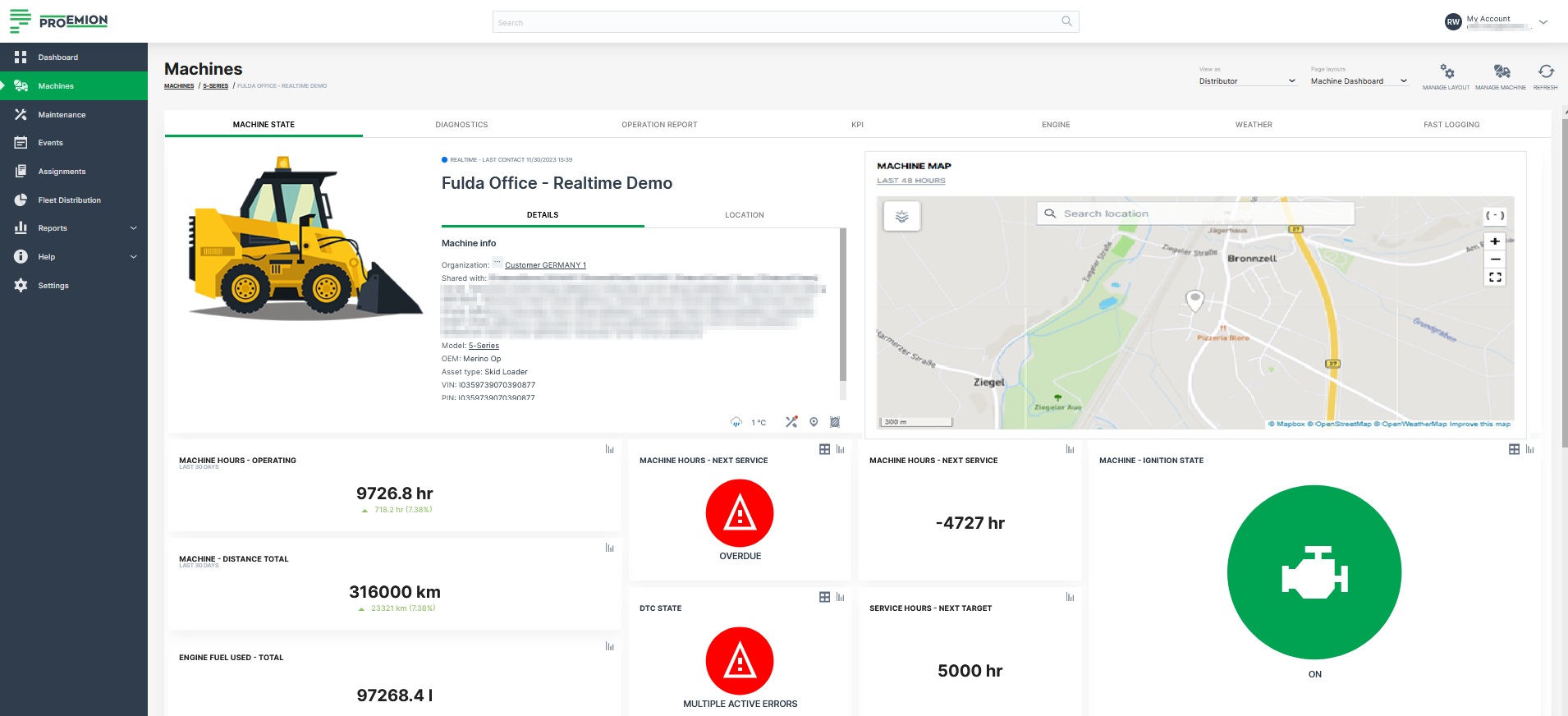
Machine Page
The Machines page is a representation of the data of a particular machine.
You can open the Machines Page via the Machines Overview, the Signal Overview Panel or searching the machine.
The navigation buttons in the top-right corner allow you to switch between the Machine Pages of your organization's machines (not shown when more than 12 machines are available)
Hovering over the navigation buttons shows the name of the next/previous machine.
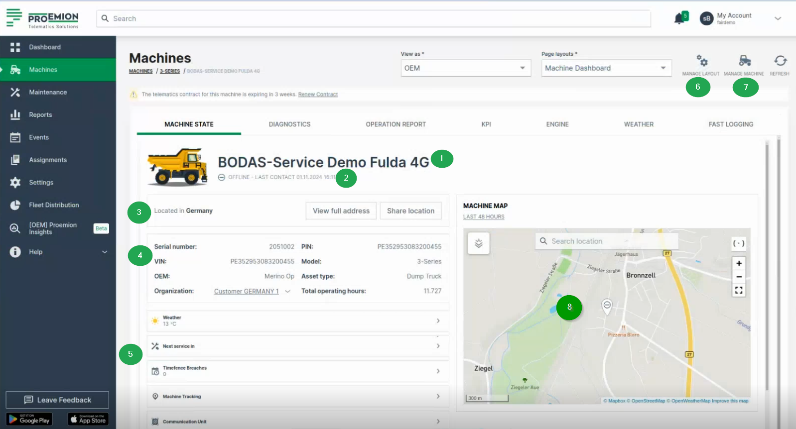
The content is defined for the machine, i.e. model. The visualization setup is configured by an Administrator.
The Machine Page panel will then display the following information:
| Item | Description |
|---|---|
| Connection Status | Current state (online/offline) since a particular date. |
| Machine Name | - |
| Organization | The organization that created the machine and share details. |
| Machine Model | - |
| Serial number | Serial number for the machine. |
Reports
Reports
The DataPortal offers both preconfigured reports and the creation of manual reports to get an instant overview of different events, signals and data of a machine as described in the following sections. For the Specific Reports, refer to the DataPortal User Manual.
Report Parameters
This page provides an overview of the general report parameters shared between the different Reporting Tools.
The report parameters in all reporting tools are largely similar. The available reporting tools are:
Depending on the assigned Permission Set, users can view, generate, or create reports.
All reporting tools share common UI behavior:
- Collapsible sections: Configuration sections are collapsible, allowing users to minimize completed metrics for a cleaner overview. The number of configured metrics remains visible when collapsed.
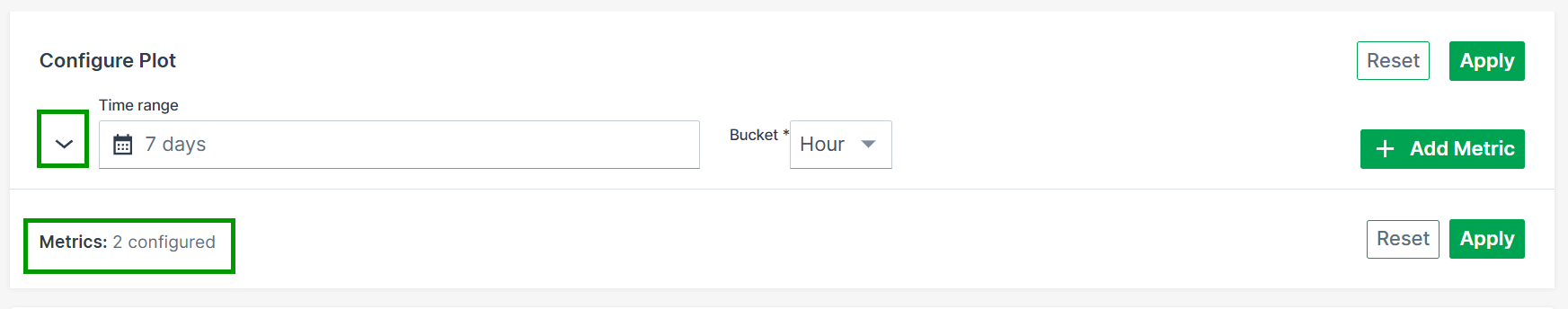
Metric limit: Each report can include up to 20 metric configurations.
The general parameters are summarized below.
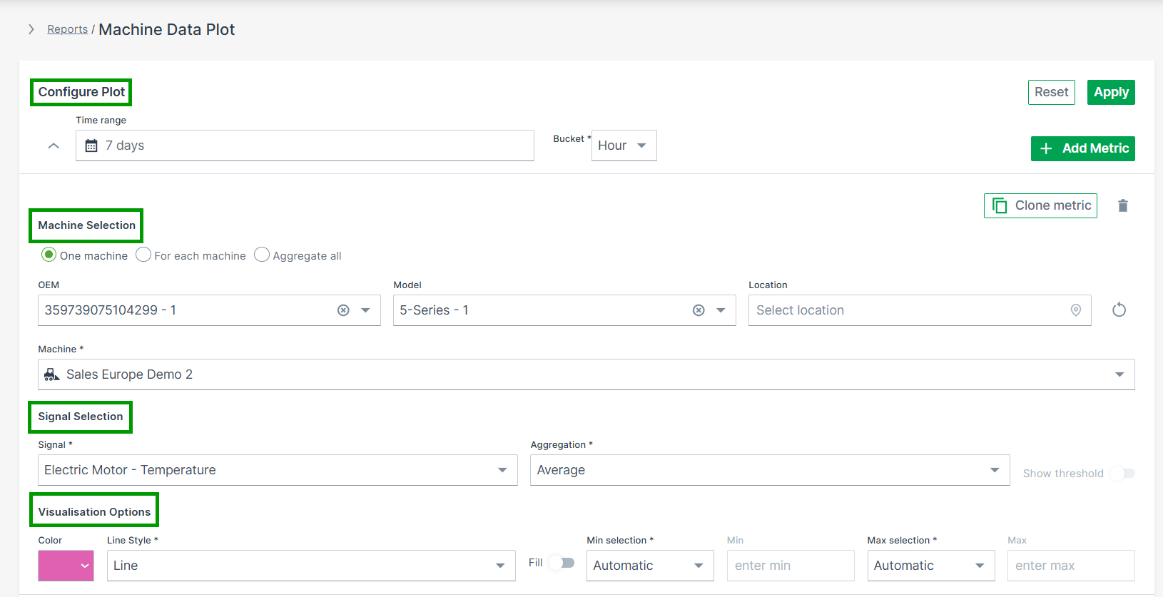
Configure Report
Defines the time range and aggregation settings.
- Time Range – Select a Relative or Absolute period for the data to be displayed
- Bucket – Defines the time unit used to aggregate data points (e.g. Second, Minute, Hour or Day)1.
- Apply / Reset – Apply the selected configuration or reset all parameters
Machine Selection
Defines which machines are included in the report and how results are aggregated.
Choose how machines are handled in the report:
- One machine – Select a single machine
- For each machine – Display results per machine
- Aggregate all – Summarize data across all selected machines
The Machine Selector is only available when One machine is selected.
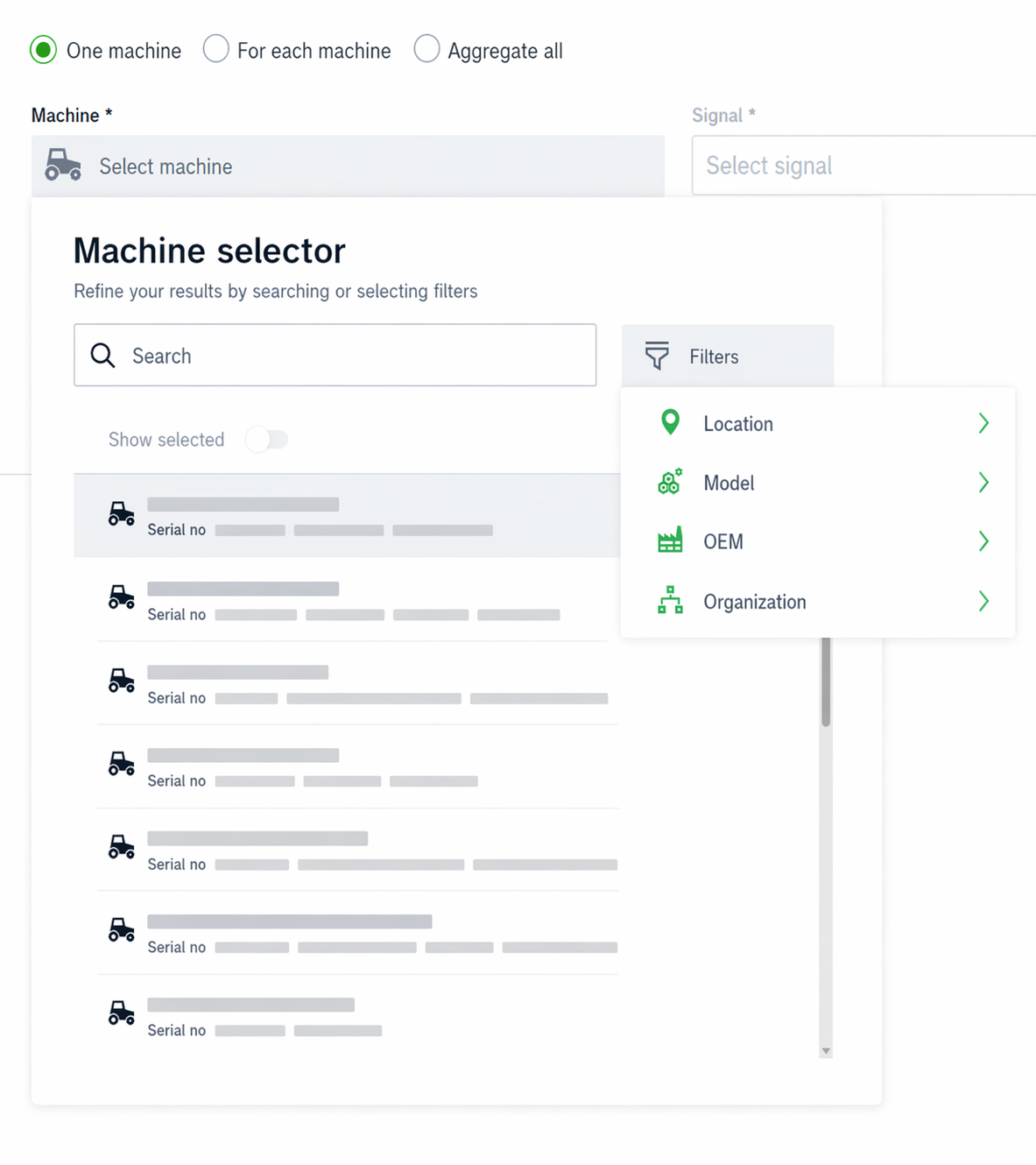
Machine Selector
The Machine Selector allows you to search, filter, and select machines within a single panel.
- Opens when clicking on the input field
- Displays all available machines if no search term is entered
-
Supports search by:
- Name
- Serial number
- VIN
- PIN
-
Filters – Narrow down machines directly in the selector:
- Location (e.g. Continent, Country)
- Model
- OEM
- Organization
-
Show Selected – Filters the list to display only the currently selected machines
-
Machine counts update dynamically based on the applied filters
- Selecting a machine automatically closes the panel
- Selected machines and filters persist when reopening the selector
Signal Selection
Defines which signal(s) are visualized in the report.
- Signal – Choose the signal to be analyzed
- Aggregation – Defines how signal values are calculated (e.g. Minimum, Maximum, Average)
- Show Threshold – Displays the defined threshold, if available
Visualization
Controls how the data is displayed.
- Color – Select the display color for the configured metric
- Advanced Options – Additional visualization settings (e.g. line style, fill, thresholds, min/max configuration)
Add / Clone Metric
Enables adding or duplicating metrics within the same report.
- + ADD METRIC – Add another signal or machine
- Clone Metric – Duplicate an existing configuration
Apply / Reset
Executes or clears the current configuration.
- Apply – Updates the report using the selected parameters
- Reset – Removes all configured selections
-
The Second bucket can be selected only if the time range is less than 3 hours (i.e. 2h 59 minutes or less) and the time range type is set to Absolute. ↩
Plots
Plots are the standard reporting tool used to visualize signal variation during a time period in the DataPortal.
You can design a report to visualize data for multiple signals for the same time period, and/or compare an identical signal from multiple machines.
Configure a Plot by following the steps below:
-
Select Reports from the left-hand menu to expand the DataPortal reporting menu.
-
Go to Reporting Tools > Plots.
-
Set up the general parameters and the Plot specific parameters (described in the section below) to configure your Plot.
Example
The following example shows data for an identical signal (Electric Motor - Temperature) from 2 different machines within a time range of 1 week. For each measurement, the unit is displayed on the axis and in the tool tip.
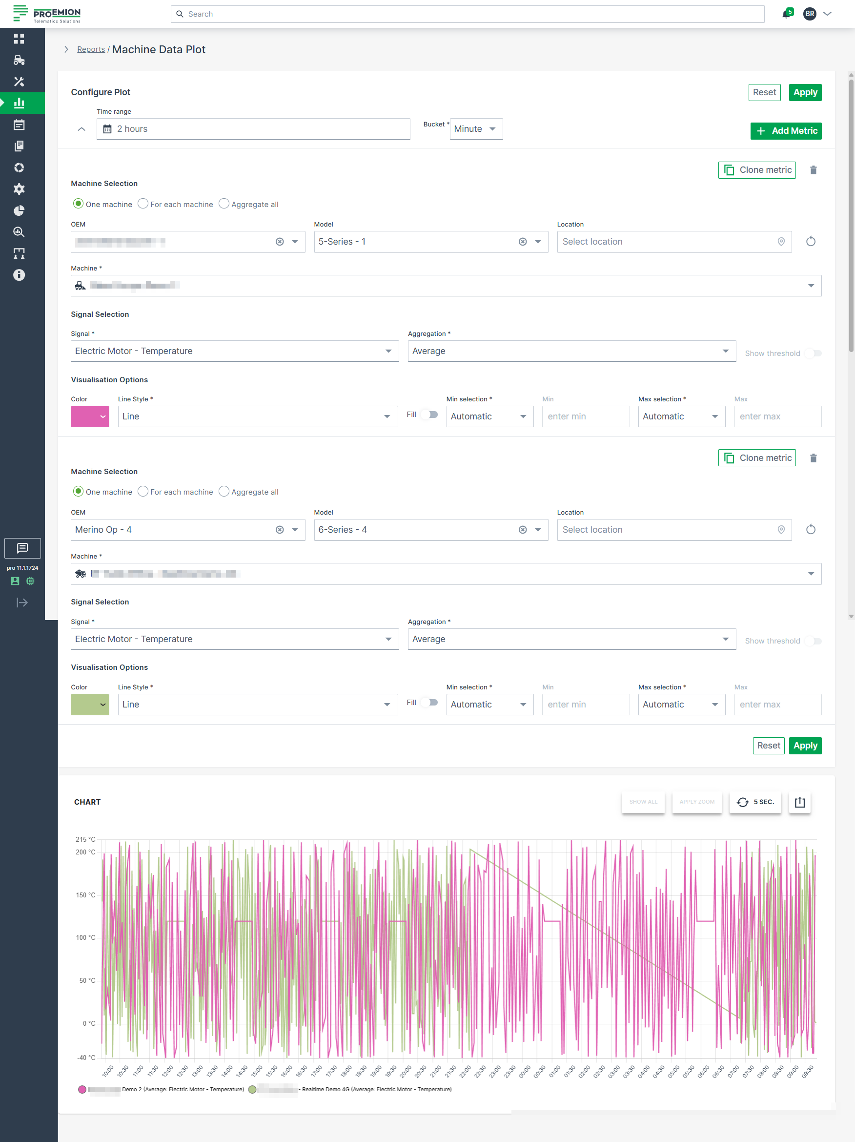
Plot Specific Parameters
The following settings are specific to Plots and extend the general configuration options.
| Configuration Section | Description |
|---|---|
| Advanced Options | Choose from various line styles to define how data is displayed: - Line (default) - Dashed Line - Dotted Line - Heavy Line - Step - Column |
Multi-Graph Layout
Plots support a multi-graph layout that allows data to be displayed in multiple synchronized charts.
After applying a Plot report, users can choose between different grouping modes to restructure the visualization.
When printing or downloading grouped Plots, each chart is exported separately to preserve a readable layout. Charts are automatically scaled to fit the available page or file size.
The following grouping modes are available:
| Grouping Mode | Description |
|---|---|
| None | Displays all configured datasets within a single chart without applying grouping. |
| Metric | Groups datasets by the configured metric. A separate chart is created for each metric. |
| Machine | Groups datasets by machine. A separate chart is created for each machine. |
| Unit | Groups datasets by measurement unit. A separate chart is created for each unique unit. |
Examples
Grouped by Metric
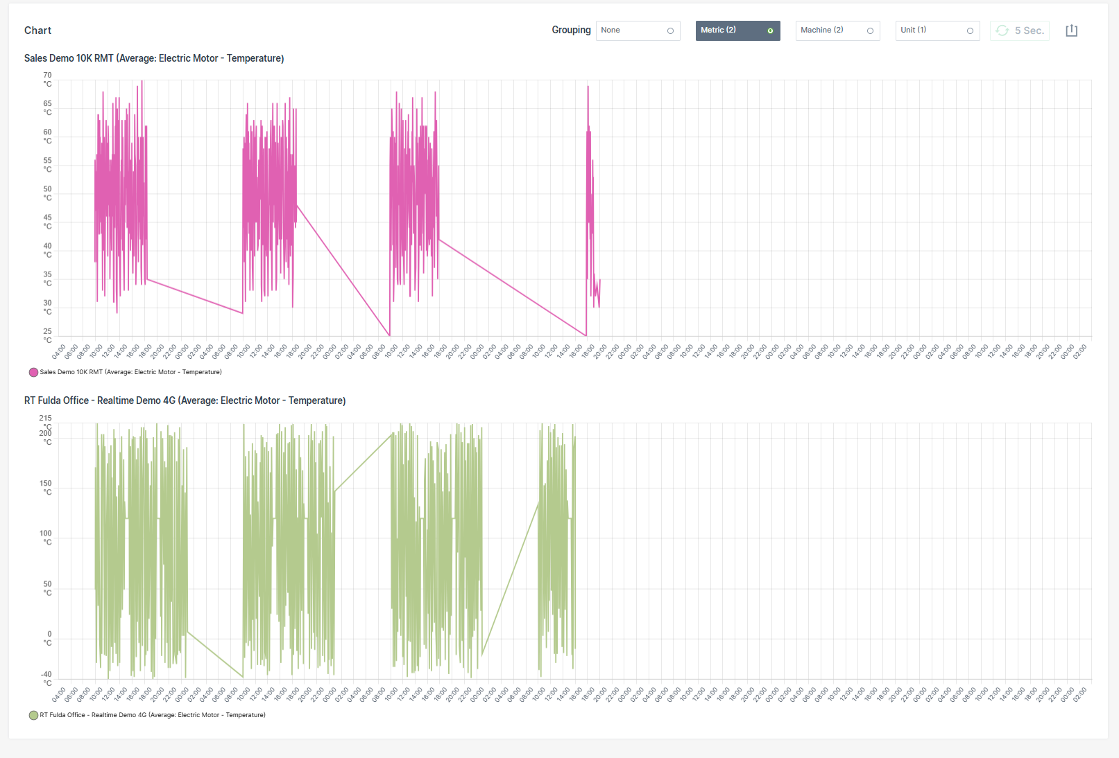
Grouped by Machine
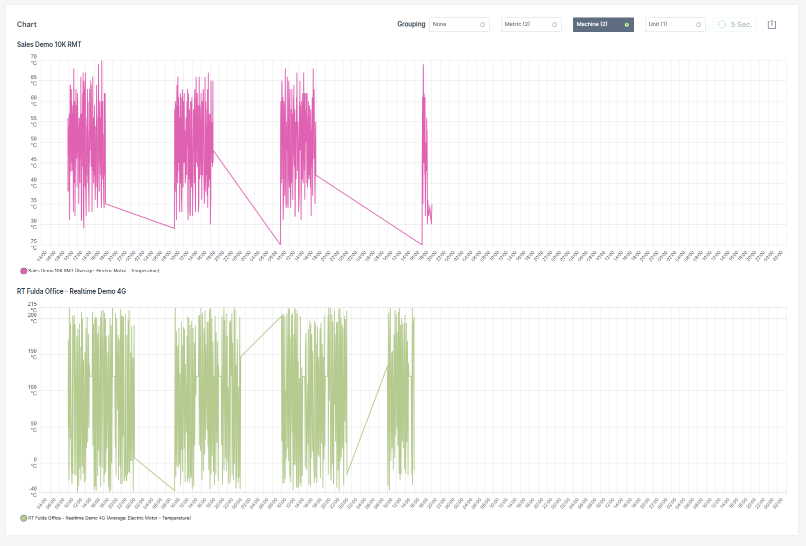
Grouped by Unit
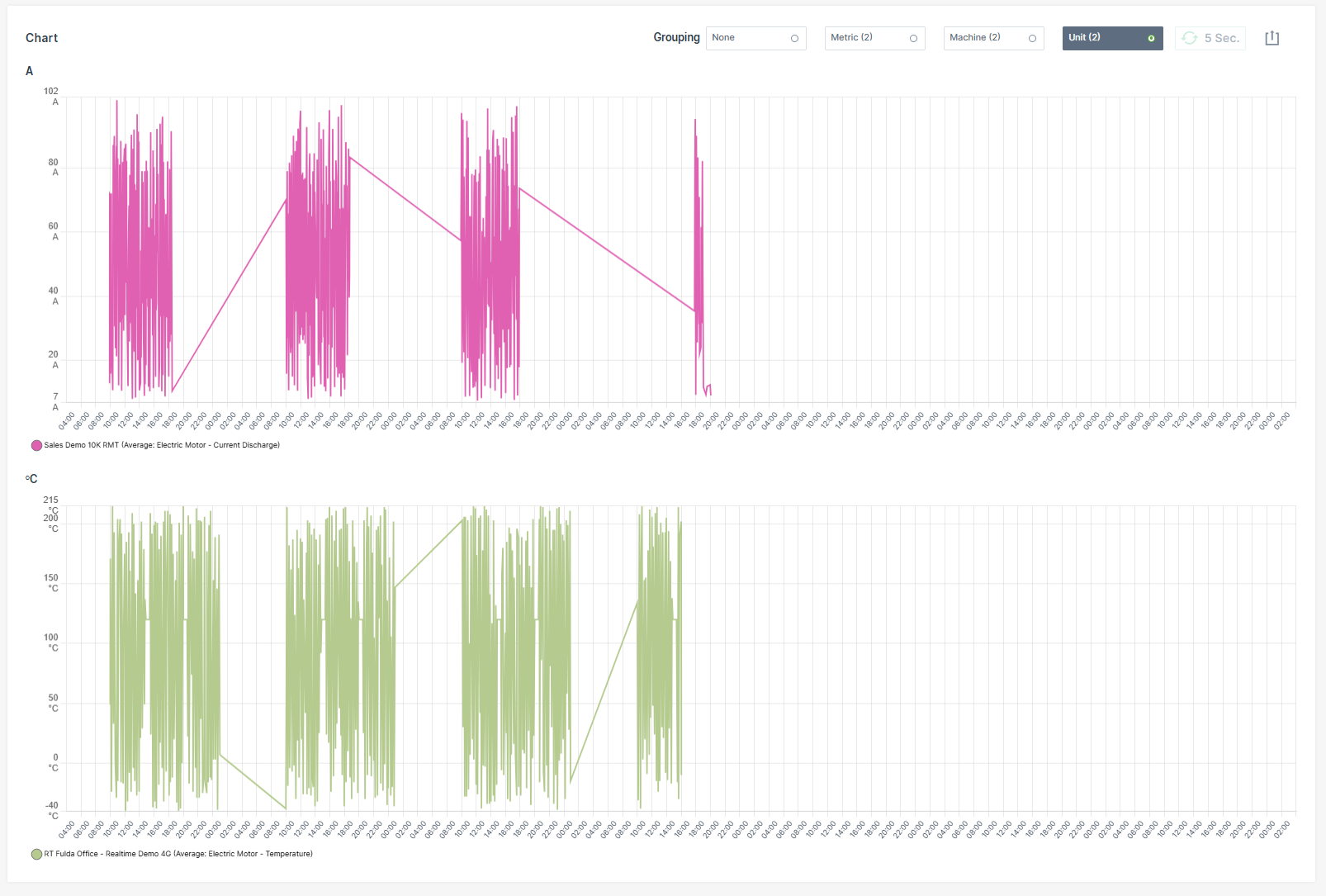
Synchronized Chart Interaction
Hovering over a chart synchronizes the cursor position and tooltip across all grouped charts.
Zooming into a time range in one chart automatically applies the same zoom level to all grouped charts.
| Chart Option | Description |
|---|---|
| Show all | Resets the Plot to the default zoom level, displaying the entire selected time range. |
| Apply Zoom | Drag a frame with the mouse pointer over a desired time interval to zoom into that period. If the Plot is already zoomed in, clicking Apply Zoom refines the resolution of data points by automatically switching the bucket size to the highest available resolution for that zoomed interval. |
| Grouping | Reorganizes the Plot into multiple synchronized charts based on the selected grouping mode: - None - Metric - Machine - Unit |
| 5 Sec. | Enables real-time monitoring by refreshing the data every 5 seconds. |
| Export Menu | Provides multiple options to share or save the report: - Request raw dataset - Download image formats: PNG, JPEG, PDF - Export data as CSV or XLSX - Print chart - Share link: Copy to clipboard or Input into address bar to save the report URL as a browser favorite. See note 1. |
Plot Export of Raw Data
The Request raw dataset option from the Export Menu allows to export the raw data of a configured Plot.
Note
When the configuration of the machine data Plot exceeds the maximum of 10 machines and 10 signals for a time range of up to 7 days, the Request raw dataset option is greyed out and a mouseover message with the allowed configuration settings will appear.
Once the export is completed, an email containing a download link for the corresponding *.csv file will be sent to the user.
The download link is valid for 24 hours only.
Visualization grouping does not affect CSV or XLSX raw data exports. Exported raw datasets always contain the original ungrouped data.
To export the raw data for a configured Plot, proceed as follows:
- Configure the Plot with a time range of max. 7 days, 10 machines and 10 signals.
- Click Apply.
- Click the Export icon.
-
Select Request raw dataset option.
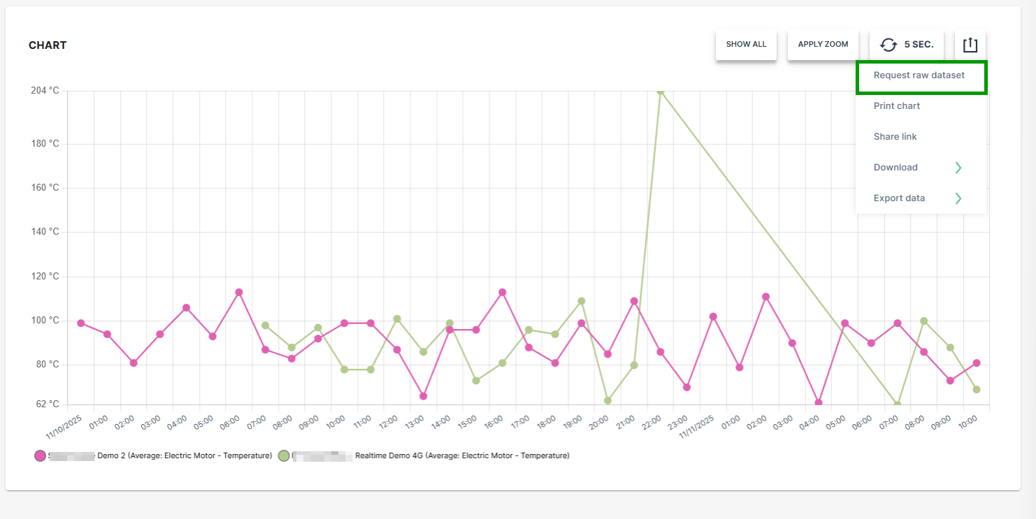
Figure 4: Request Raw Dataset -
Select the desired option for the time stamp settings.
-
Click SEND REQUEST.
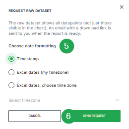
Figure 5: Request Raw Dataset - Send Request A confirmation that the request has been processed will be displayed.

Figure 6: Request Raw Dataset - Confirmation -
Check the inbox of your user email address.
-
Once the export has finished, an email with the download link for the .csv file is received.
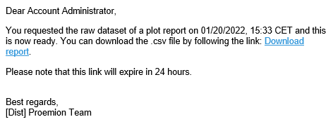
Figure 7: Request Raw Dataset - Email -
Download the provided
*.csvfile.
The raw data within the *.csv file can be used for further processing and analysis.
Visualization grouping does not affect CSV or XLSX raw data exports. Exported raw datasets always contain the original ungrouped data.
Accessing Reports Through Widgets
Widgets that display Time Series Data have a graph icon  in the upper right-hand corner. Click on the icon to open the Report Parameters for the signals displayed in the widget.
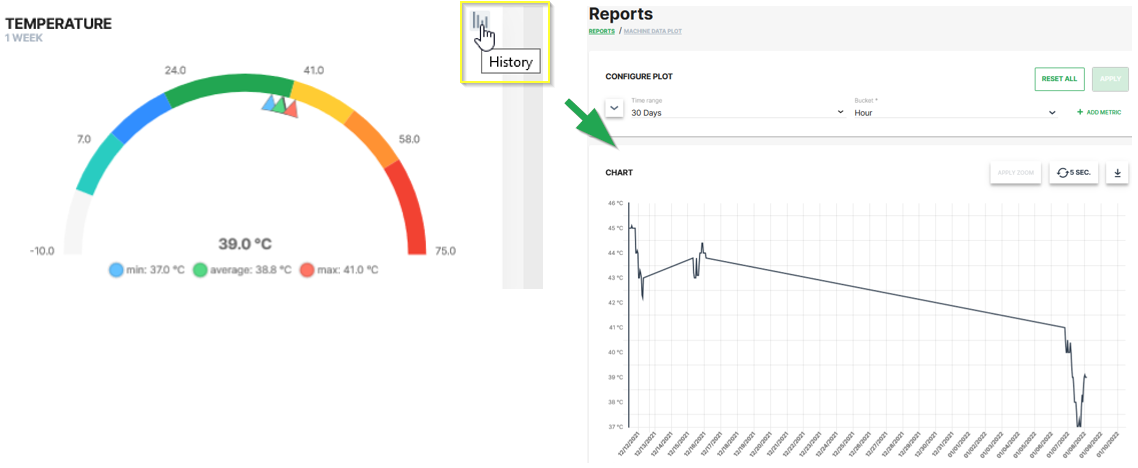
The report allows you to view the historical variations of the selected signal for a given time period.
-
This procedure allows you to reopen a preconfigured report at a later point of time. ↩
Scatter/Bubble Plots
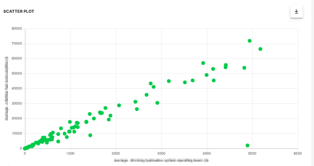
A Scatter Plot is a two-dimensional plot that uses dots to represent values for two different numeric variables. The position of each dot on the horizontal and vertical axis indicates values for an individual data point. Scatter plots are used to observe relationships between variables.
Scatter Plot
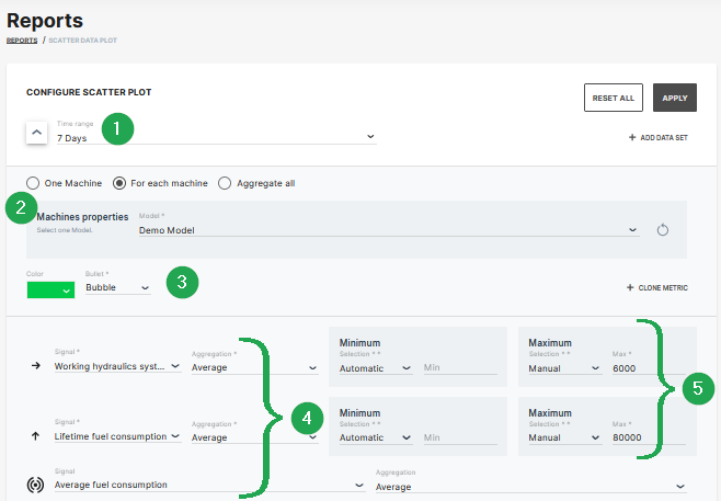
The example shows data sets from machines which belong to a demo model. The plot can be used for visual comparison.
| # | Signal | Description |
|---|---|---|
| 1 | Time Range | Select the time period for the measurements up to the previous 2 years. |
| 2 | Indicator/Color | Choose from bubble, diamond, triangle up, triangle down symbols and the color. |
| 3 | Model/Machine | Select the model and machine to display the comparison. |
| 4 | Signal/Aggregation | Select the signal to be the displayed and the Time Series Data. |
| 5 | Scaling | Scale automatically, manually or use predefined min/max values from PDC. |
Bubble Plot
The scatter plot can be extended to a bubble plot that is used to look at relationships between three numeric variables instead of two. Each dot in the bubble chart corresponds with a single data point, and the variables’ values for each point are indicated by horizontal position, vertical position, and dot size.
This example shows configuration of a bubble chart:
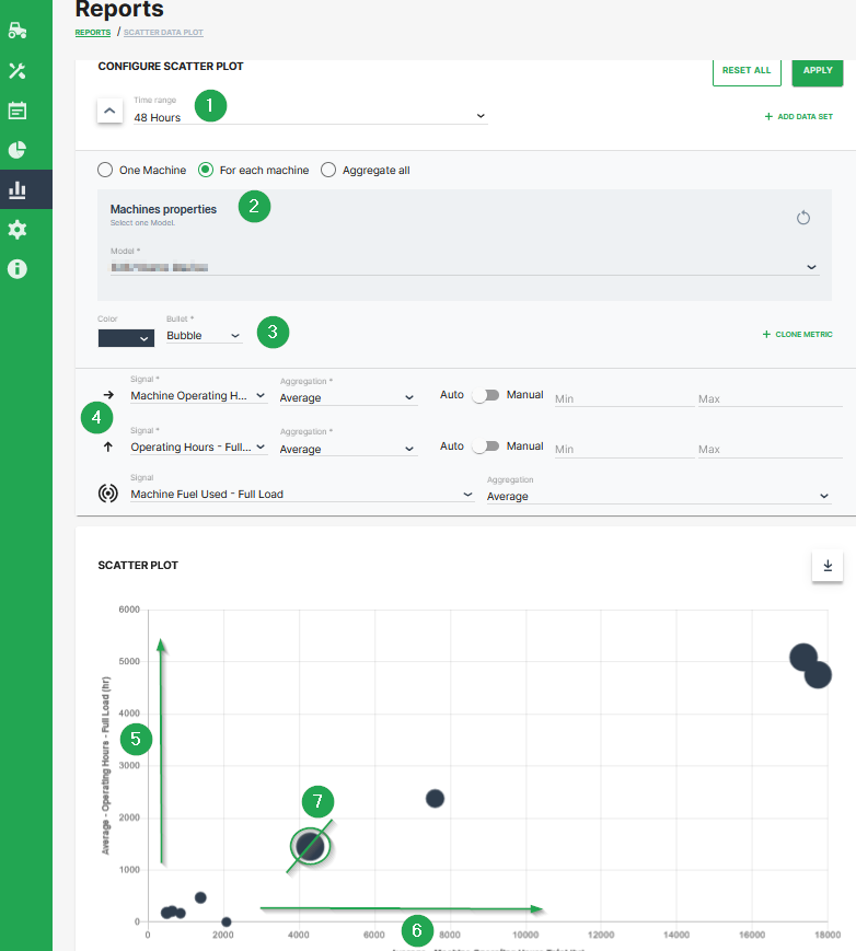
| # | Description |
|---|---|
| 1 | Time range selection. |
| 2 | Selection of a specific machine(s), machines of a certain model and optional aggregation of entire data set. |
| 3 | Color and shape of the marker |
| 4 | Signal selection |
| 5 | Machine Operating Hours - Full Load. Represented by the location of the dot on the vertical axis. |
| 6 | Machine Operating Hours Total. Represented by the location of the dot on the horizontal axis. |
| 7 | Machine Fuel Used - Full Load. Represented by the dot size. |
Additional Functionality
- The chart can be downloaded in various image formats or exported to raw data as shown.
- A slider bar allows the user to zoom in and out of the Scatter Plot or select a specific segment of the data-set to visualise.
Tables
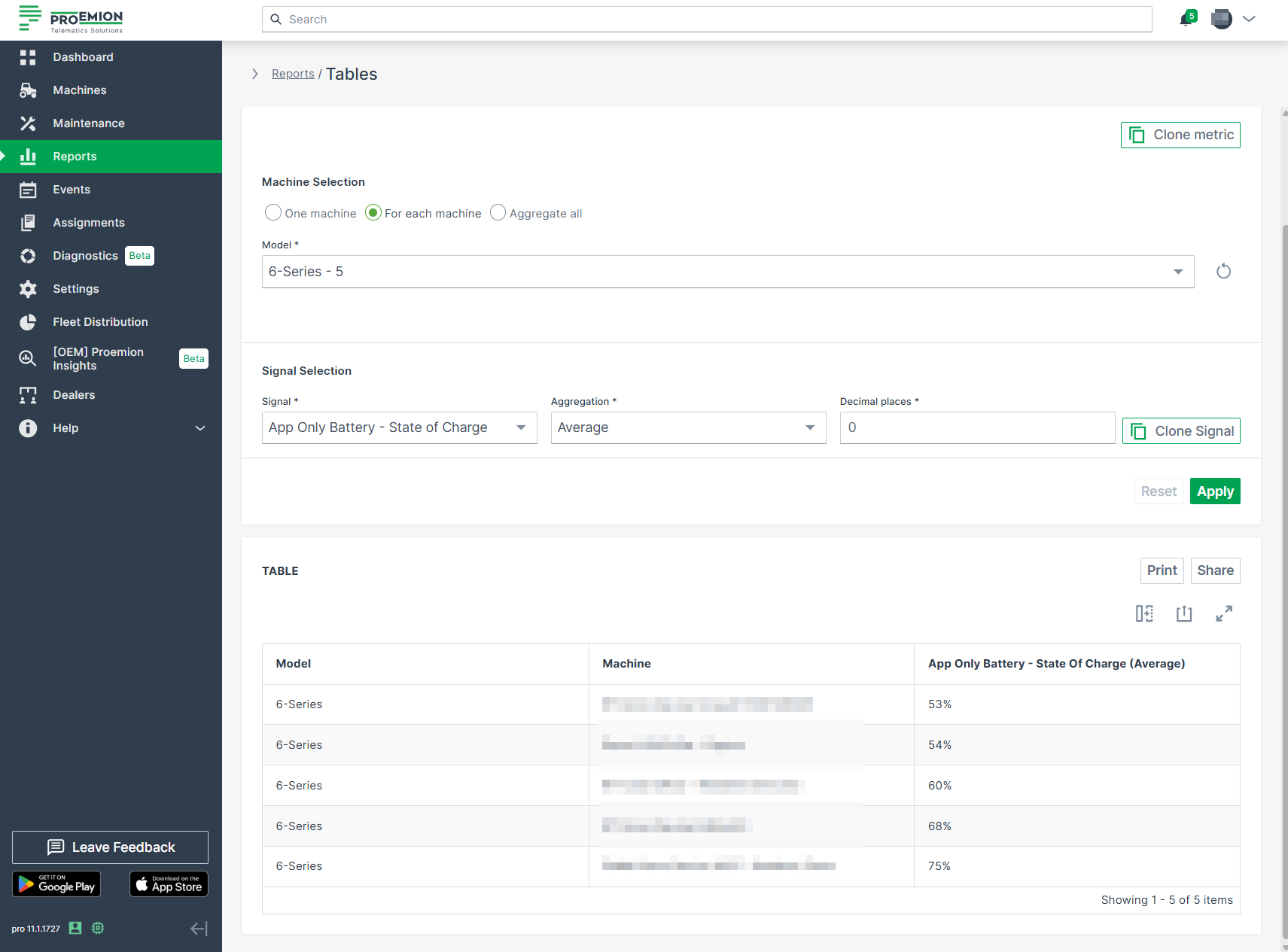
The Tables report is the simplest visualisation for data sets.
To configure a Tables report, proceed as follows:
-
Select Reports from the left-hand menu to expand the DataPortal reporting menu.
-
Go to Reporting Tools > Tables.
-
Set up the general parameters to configure your Table.
Example
The following example shows the output results of the data sets from different machines of a specific model on a single table.
Themes
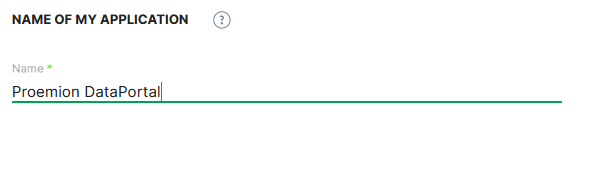
As an Administrator, you can customize the theme (logo, color scheme, title, etc.) of your organization in the DataPortal
To do so, select Settings > Portal Appearance > Theme
The Themes customization page opens where you can adapt the design for different sections and elements of the DataPortal:
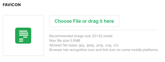
Browser Title Bar
In the following sections, the brand name and the favicon are defined which should then be displayed on the webpage tab.
Design
In the following section, adapt the primary, accent and header colors for your brand and the map style.
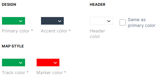
-
Primary color applies to selected menus and hovering over menus in the main menu on the left side, see example with red color:
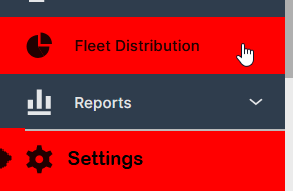
Figure 4: Primary Color - red color example -
Accent color applies to the background of the main menu, see example with red color:
Figure 5: Accent Color - red color example -
Header color applies to the header of the DataPortal, see example with red color:

Figure 6: Header Color - red color example 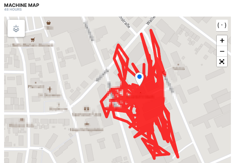
Figure 7: Map Track Color - red color example 
Figure 8: Map Marker Color - red color example
Logo
In the following section the company logo is defined, which will be displayed in the upper left corner of the DataPortal.
Machine icon
In the following section, the machine icon is defined
The machine icon is displayed in the main menu next to Machines menu.
Login Page
In this area the copyright notice, image and footer links for the Login Page are defined.
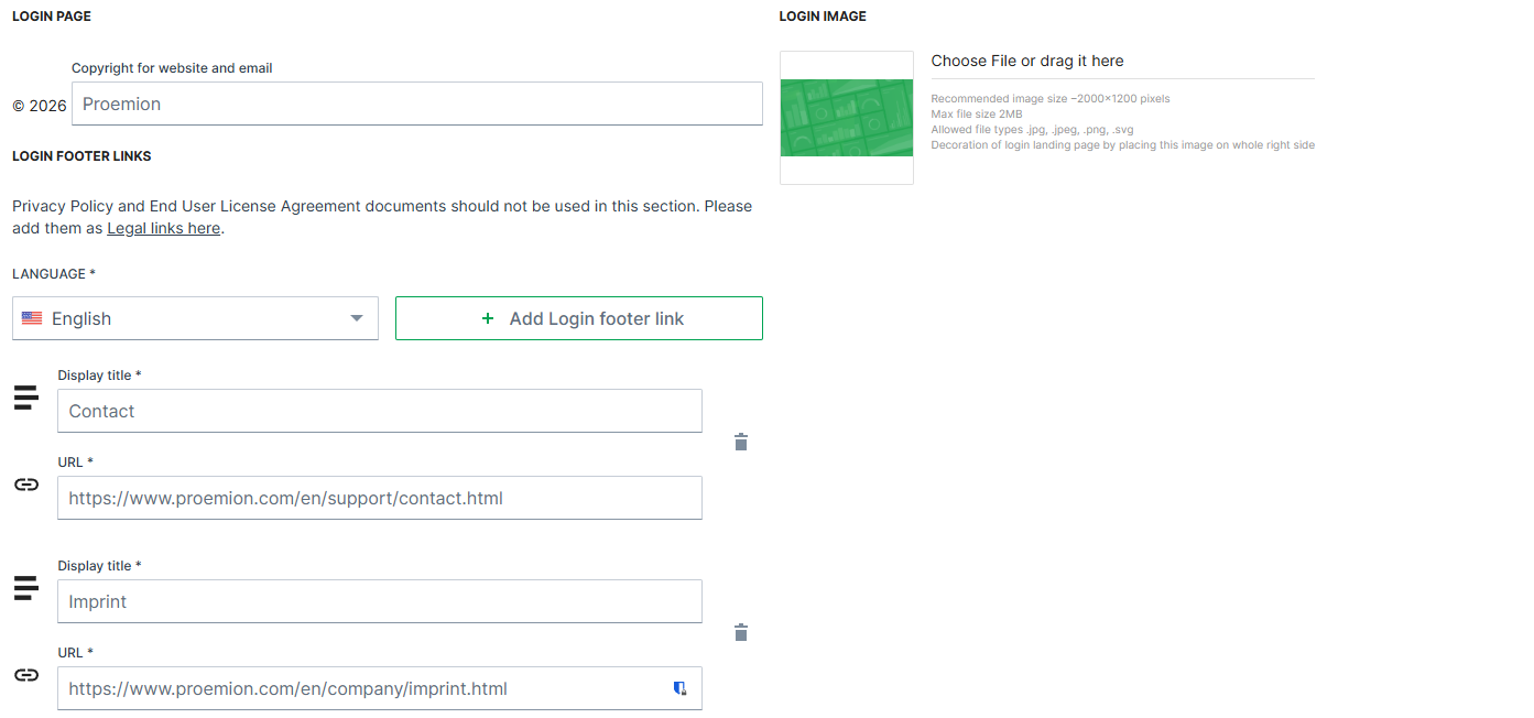
| Item | Description |
|---|---|
| Copyright | Defines the text displayed in the copyright notice in the footer of the Login Page and in system-generated emails. The company name can be customized. The year is automatically generated by the system and cannot be modified. |
| Footer links | Add static links and display text (100 character maximum) to the page footer. These links can point to external resources such as company websites or support pages. They are part of the customizable branding configuration and are not related to the sign-out process. |
| Login image | Upload your own image to the standard DataPortal Login Page. |
For more information, see Sign in to the DataPortal.
Behavior Options
The Behavior options allow you to customize the user experience in the Machines Overview.
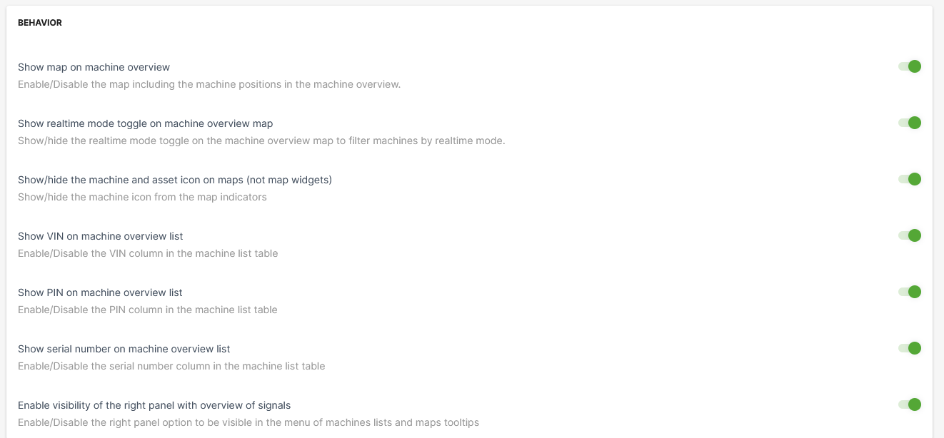
| Item | Description |
|---|---|
| Show map on machine overview | Show the map in the Machines Overview. |
| Show realtime mode toggle on machine overview map | This option allows the user to filter machines by their operating mode on maps. |
| Show/hide the machine and asset icon on maps (not map widgets) | By disabling this option, the asset icons are not displayed, instead only a map icon is displayed, see following example: toggle on (default): toggle off ("hide asset icon"): |
| Show VIN or machine overview list | Include a column with the Vehicle Identification Number (VIN) in the list of machines. |
| Show PIN on machine overview list | Include a column with Personal Identification Number (PIN) in the list of machines. |
| Show serial number on machine overview list | Show the serial number column in the list of machines. |
| Enable visibility of the right panel with the overview of signals | Signal Overview Panel appears when selecting a machine from the machine list or on the map. |
Custom Menu Entries
The DataPortal allows you to add menu categories to the main menu with URL links provided in the panel on the left side.
To add a menu category with menu links to your DataPortal menu, go to Themes > Menu section and proceed as follows:
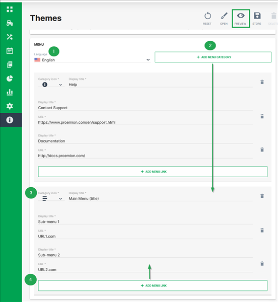
-
Select the language of the DataPortal you want to add the new menu category for.
-
Click +Add Menu Category
The section for menu category opens. -
Select a Category icon and add the Display title that will be used as the header of the drop-down-menu in the panel.
-
To add sub-menus, click Add menu link.
-
Add the Display title and provide the URL for the clickable sub-menus
You may add as many menu links as desired. -
To create a preview of your custom menu entries, click Preview in the upper-right corner. The preview is shown in the same window and can be stopped by selecting Finish preview.
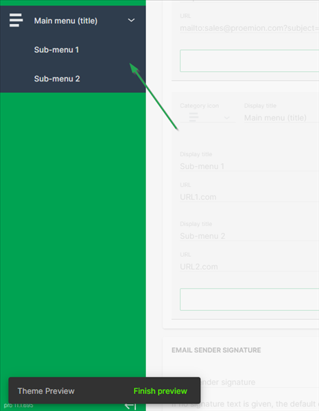
Figure 14: Custom Menu Preview -
To save your changes, click Store in the upper right corner.
Custom DataPortal Email Sender Signature
You can customize the signature text in all email communication sent from the DataPortal. In the Themes area, scroll to the bottom of the page until you see the headline/field Email Sender Signature.
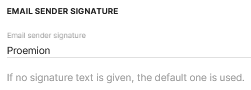
Simply enter the text you want to appear in all of your DataPortal emails and save your changes.
Service and Support
The latest versions of the drivers, software, firmware, and documentation are available at Document Library.
Do you need help or want to report a bug?
Visit Proemion for more information, or raise a ticket via Support.
Firmware Updates and Support
To ensure the best performance and security of your devices, we strongly recommend always installing the latest firmware provided by Proemion.
Please note:
We do not provide technical support for issues caused by outdated firmware.
Errors resulting from outdated firmware are considered non-qualified errors and are not covered by warranty or support.
Regular firmware updates are essential to maintaining the functionality of your devices.
If you need assistance with the update process, please contact our Service and Support.
For more information on the Firmware Update, check the device manual of your device at the Document Library.