Plots
Plots are the standard reporting tool used to visualize signal variation during a time period in the DataPortal.
You can design a report to visualize data for multiple signals for the same time period, and/or compare an identical signal from multiple machines.
Configure a Plot by following the steps below:
-
Select Reports from the left-hand menu to expand the DataPortal reporting menu.
-
Go to Reporting Tools > Plots.
-
Set up the general parameters and the Plot specific parameters (described in the section below) to configure your Plot.
Example
The following example shows data for an identical signal (Electric Motor - Temperature) from 2 different machines within a time range of 1 week. For each measurement, the unit is displayed on the axis and in the tool tip.
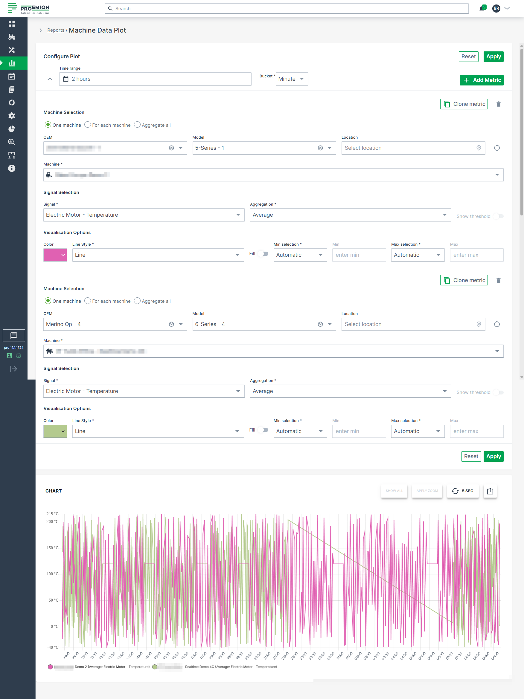
Plot Specific Parameters
The following settings are specific to Plots and extend the general configuration options.
| Configuration Section | Description |
|---|---|
| Advanced Options | Choose from various line styles to define how data is displayed: - Line (default) - Dashed Line - Dotted Line - Heavy Line - Step - Column |
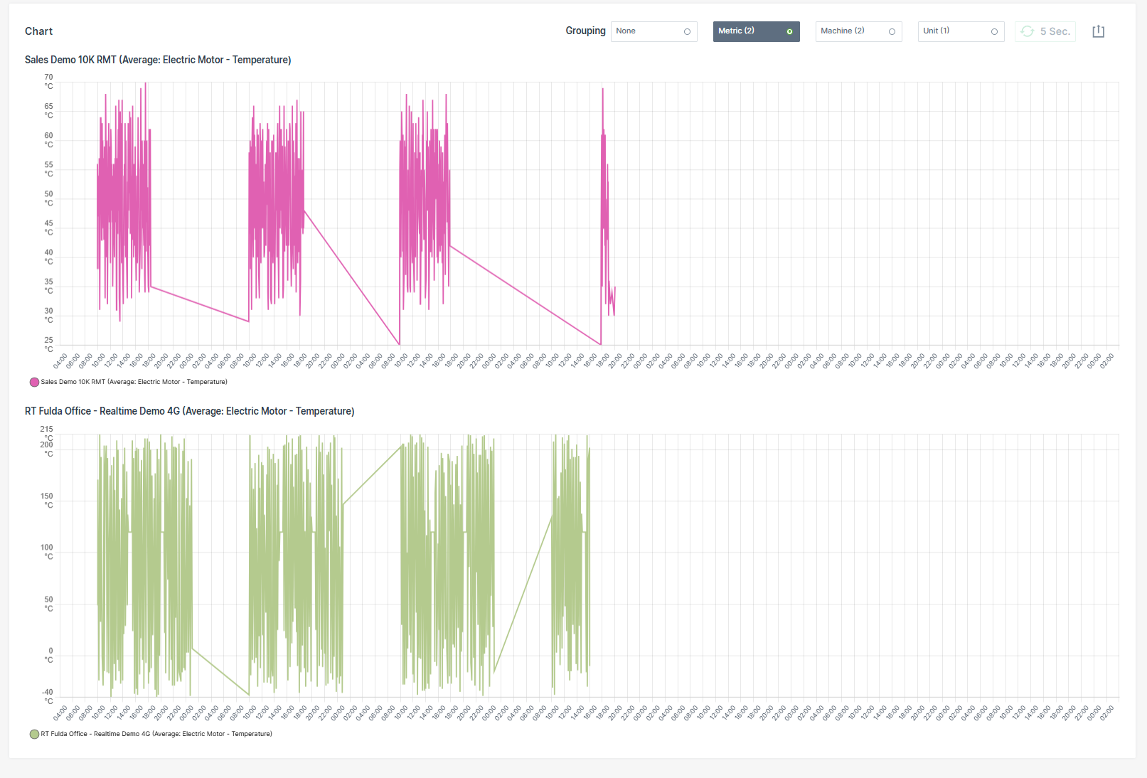
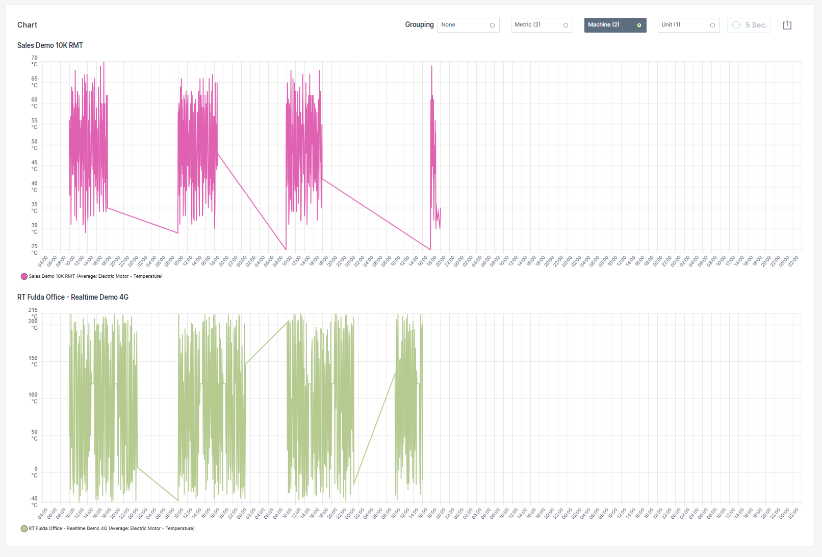
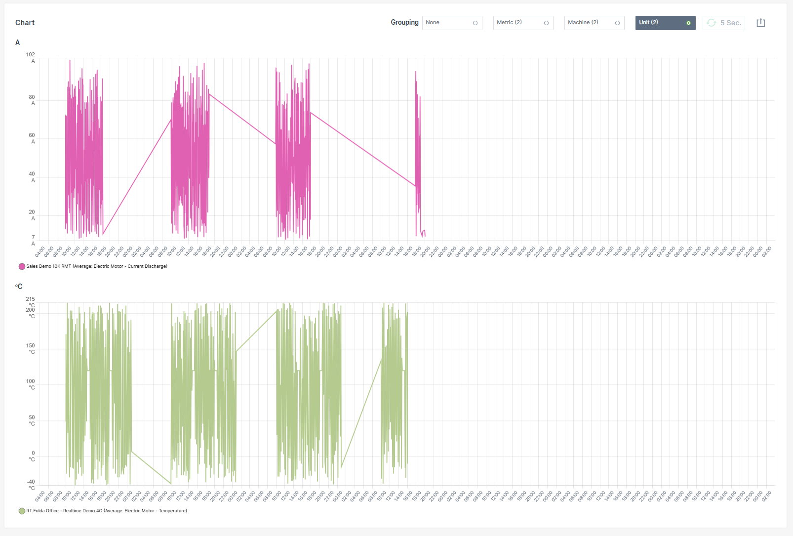
Multi-Graph Layout
Plots support a multi-graph layout that allows data to be displayed in multiple synchronized charts.
After applying a Plot report, users can choose between different grouping modes to restructure the visualization.
When printing or downloading grouped Plots, each chart is exported separately to preserve a readable layout. Charts are automatically scaled to fit the available page or file size.
The following grouping modes are available:
| Grouping Mode | Description |
|---|---|
| None | Displays all configured datasets within a single chart without applying grouping. |
| Metric | Groups datasets by the configured metric. A separate chart is created for each metric. |
| Machine | Groups datasets by machine. A separate chart is created for each machine. |
| Unit | Groups datasets by measurement unit. A separate chart is created for each unique unit. |
Examples
Grouped by Metric
Grouped by Machine
Grouped by Unit
Synchronized Chart Interaction
Hovering over a chart synchronizes the cursor position and tooltip across all grouped charts.
Zooming into a time range in one chart automatically applies the same zoom level to all grouped charts.
| Chart Option | Description |
|---|---|
| Show all | Resets the Plot to the default zoom level, displaying the entire selected time range. |
| Apply Zoom | Drag a frame with the mouse pointer over a desired time interval to zoom into that period. If the Plot is already zoomed in, clicking Apply Zoom refines the resolution of data points by automatically switching the bucket size to the highest available resolution for that zoomed interval. |
| Grouping | Reorganizes the Plot into multiple synchronized charts based on the selected grouping mode: - None - Metric - Machine - Unit |
| 5 Sec. | Enables real-time monitoring by refreshing the data every 5 seconds. |
| Export Menu | Provides multiple options to share or save the report: - Request raw dataset - Download image formats: PNG, JPEG, PDF - Export data as CSV or XLSX - Print chart - Share link: Copy to clipboard or Input into address bar to save the report URL as a browser favorite. See note 1. |
Plot Export of Raw Data
The Request raw dataset option from the Export Menu allows to export the raw data of a configured Plot.
Note
When the configuration of the machine data Plot exceeds the maximum of 10 machines and 10 signals for a time range of up to 7 days, the Request raw dataset option is greyed out and a mouseover message with the allowed configuration settings will appear.
Once the export is completed, an email containing a download link for the corresponding *.csv file will be sent to the user.
The download link is valid for 24 hours only.
Visualization grouping does not affect CSV or XLSX raw data exports. Exported raw datasets always contain the original ungrouped data.
To export the raw data for a configured Plot, proceed as follows:
- Configure the Plot with a time range of max. 7 days, 10 machines and 10 signals.
- Click Apply.
- Click the Export icon.
-
Select Request raw dataset option.
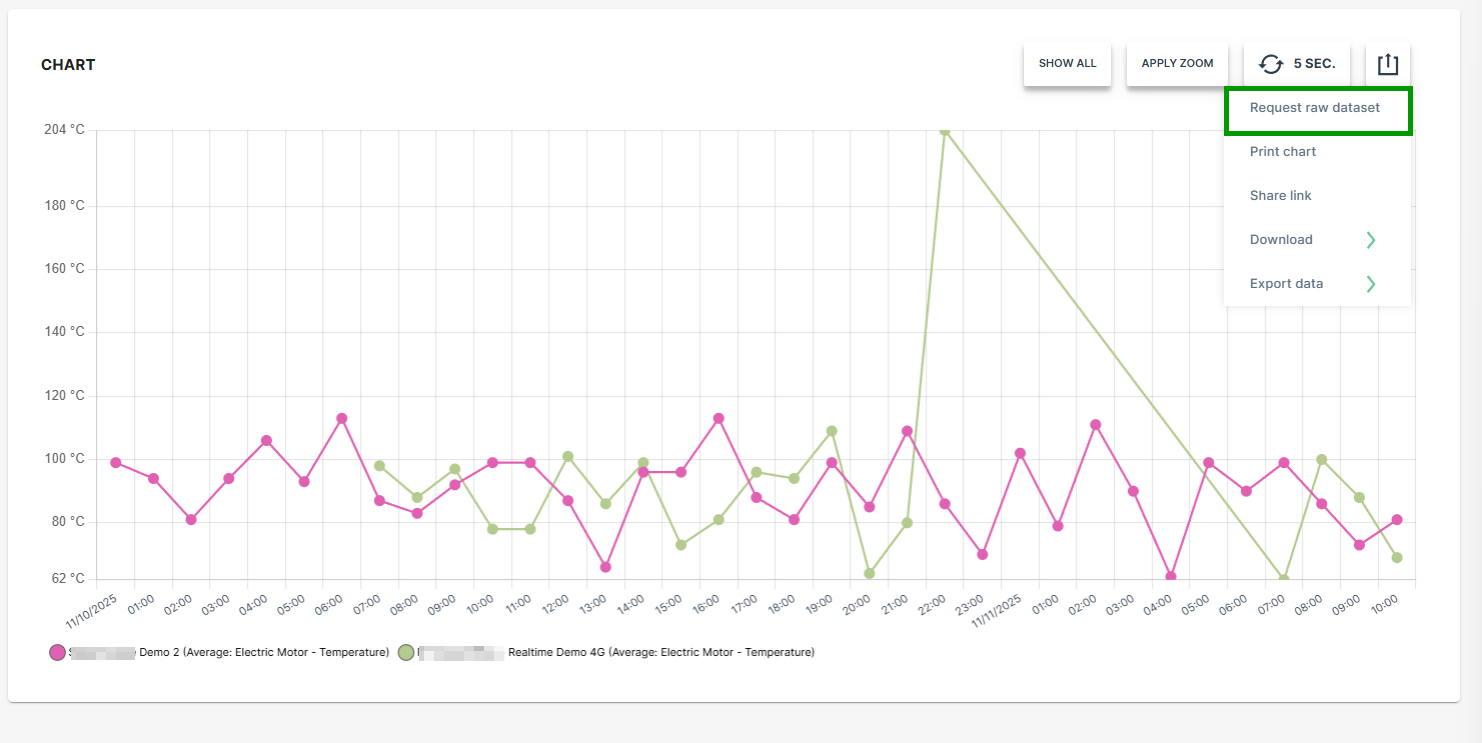
Figure 4: Request Raw Dataset -
Select the desired option for the time stamp settings.
-
Click SEND REQUEST.
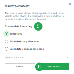
Figure 5: Request Raw Dataset - Send Request A confirmation that the request has been processed will be displayed.

Figure 6: Request Raw Dataset - Confirmation -
Check the inbox of your user email address.
-
Once the export has finished, an email with the download link for the .csv file is received.
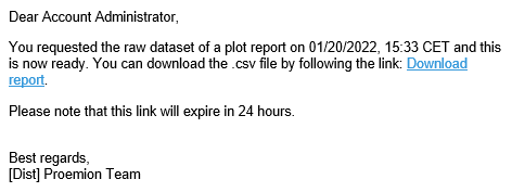
Figure 7: Request Raw Dataset - Email -
Download the provided
*.csvfile.
The raw data within the *.csv file can be used for further processing and analysis.
Visualization grouping does not affect CSV or XLSX raw data exports. Exported raw datasets always contain the original ungrouped data.
Accessing Reports Through Widgets
Widgets that display Time Series Data have a graph icon  in the upper right-hand corner. Click on the icon to open the Report Parameters for the signals displayed in the widget.
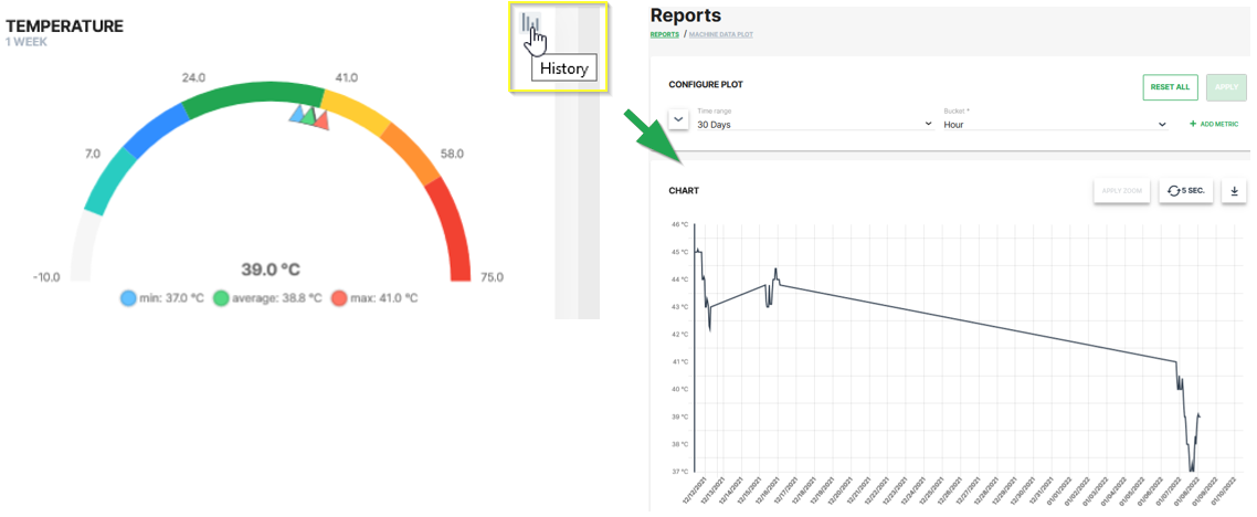
The report allows you to view the historical variations of the selected signal for a given time period.
-
This procedure allows you to reopen a preconfigured report at a later point of time. ↩