Scatter/Bubble Plots
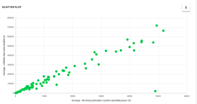
A Scatter Plot is a two-dimensional plot that uses dots to represent values for two different numeric variables. The position of each dot on the horizontal and vertical axis indicates values for an individual data point. Scatter plots are used to observe relationships between variables.
Scatter Plot
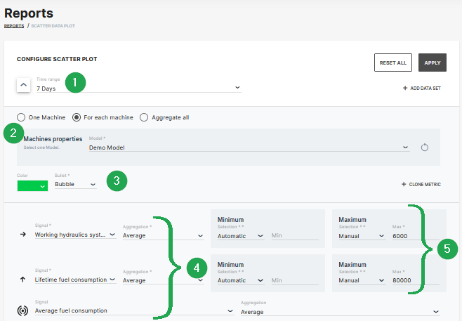
The example shows data sets from machines which belong to a demo model. The plot can be used for visual comparison.
| # | Signal | Description |
|---|---|---|
| 1 | Time Range | Select the time period for the measurements up to the previous 2 years. |
| 2 | Indicator/Color | Choose from bubble, diamond, triangle up, triangle down symbols and the color. |
| 3 | Model/Machine | Select the model and machine to display the comparison. |
| 4 | Signal/Aggregation | Select the signal to be the displayed and the Time Series Data. |
| 5 | Scaling | Scale automatically, manually or use predefined min/max values from PDC. |
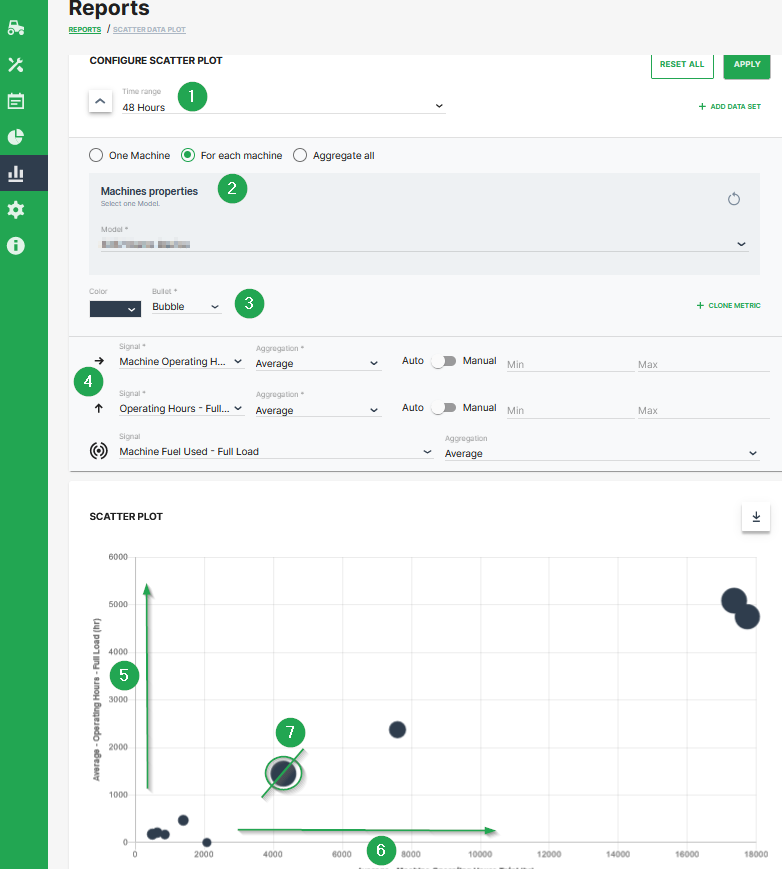
Bubble Plot
The scatter plot can be extended to a bubble plot that is used to look at relationships between three numeric variables instead of two. Each dot in the bubble chart corresponds with a single data point, and the variables’ values for each point are indicated by horizontal position, vertical position, and dot size.
This example shows configuration of a bubble chart:
| # | Description |
|---|---|
| 1 | Time range selection. |
| 2 | Selection of a specific machine(s), machines of a certain model and optional aggregation of entire data set. |
| 3 | Color and shape of the marker |
| 4 | Signal selection |
| 5 | Machine Operating Hours - Full Load. Represented by the location of the dot on the vertical axis. |
| 6 | Machine Operating Hours Total. Represented by the location of the dot on the horizontal axis. |
| 7 | Machine Fuel Used - Full Load. Represented by the dot size. |
Additional Functionality
- The chart can be downloaded in various image formats or exported to raw data as shown.
- A slider bar allows the user to zoom in and out of the Scatter Plot or select a specific segment of the data-set to visualise.