Cluster Heat Map
The Cluster Heat Map widget shows the variation of specific signals within a time period. Different Aggregation functions of the signal are available for representation and can be grouped in either hours or days.
Configuration
Configure the widget and put it on the Organization Dashboard and/or the Model Dashboard by following the steps below:
It is highly recommended to adapt a Machine Page (Model Dashboard) centrally via the Machine Page Layout. If you need to configure the Machine Page for the selected machine only, proceed as follows:
-
In the selected Machine Page, select Manage Layout > Add widgets.
-
Select the desired widget. A preview will be shown.
-
Click Apply. This forwards you to the widget configuration dialog with the options described below.
If you need to adapt the Organization Dashboard, select the desired dashboard configuration and click Edit > Add  to open the widgets catalog, see also Add Widgets to the Organization Dashboard.
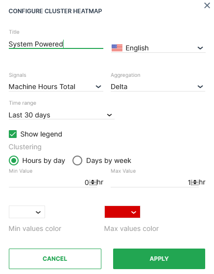
| Item | Description |
|---|---|
| Title | The label for the widget (English is the default, additional languages must be configured. See Language below). |
| Language | Select the language for the title of the widget. |
| Model* | Model name (see Note). |
| Machine* | Machine name (see Note). |
| Signal | Select the signal to be displayed. |
| Aggregation | The value returned for the signal, calculated using all the measurements within each Bucket. |
| Time | Select a predefined, relative time range, e.g. Last 24 hours or select a custom one, e.g. This last 5 Days, see Time selection. |
| Show Legend | Toggle the display of the tooltip (on hover) and the key underneath the map. |
| Clustering | How to group the values to apply Aggregation. |
| Min Value | Where the counter will start. |
| Max value | Peak value where the limits of signal capacity or usage are reached. |
| Colour Theme (Min/Max) | Select the color graduation to indicate the change in signal value. |
Note
*These config options can only be selected from the Organization Dashboard.
Sample
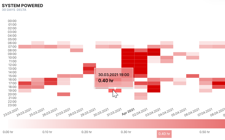
The sample above shows the average temperature variation from -10 degrees to 40 degrees over a period of 180 days measured each day of the week. Hover over a heatmap segment to display the timestamp/signal value on the heatmap and the signal value beneath the table.