1. Purpose of this Guide
1.1. Who is it for?
This guide is intended for the person responsible for administrating dashboards and machine details pages, as they are in charge of providing a trustworthy representation of their machines to their end users.
1.2. Why should you care?
These DataPortal pages, dashboards, and machine details pages are the most consumed ones by dealers and machine owners. And therefore, their ease of use is critical to their perception of your brand and your services. Each of these user segments has its own needs. This means that dealers and machine owners will reach these pages looking for different information.
When performing extensive user research, we discovered that machine owners were dissatisfied with the information they got delivered about their machines via the machine details pages. We followed up to gather more information about what made a good machine details page for a machine owner.
This guide reflects the knowledge gained through this research. It ensures that your end users, the owners of your machines, get the most value out of the DataPortal by providing them with the right information to meet their goals via well-crafted machine details pages.
| Now the DataPortal features a new way of handling machine detail pages by organization type that fully aligns with recommendations. See Machine Page Layout in the DataPortal User Manual. |
1.3. What outcomes should I expect by following this guide?
This guide provides you with:
-
A description of the core information that machine owners are looking after when using the DataPortal, see this chapter.
-
A sample template for machine details pages tailored for machine owners, see Sample Template for an MO-oriented Machine Details Page and Structure of the Sample Template.
-
In case the template is not enough and you want to extend it, we complement the guide with general rules on how to best visualize machine data to make it easily understandable for machine owners, see Working with Machine Details Pages.
If you take action and update your machine detail pages using this guide, you can expect:
-
That your machine owners will be more satisfied with your product and services.
-
An increase in customer satisfaction scores.
-
Less frustration and complaints from machine owners.
Machine owners are the proprietors of the equipment produced by you, the OEM. Usually, machine owners have machines from more than one brand. So even if you see that a customer of yours only holds one or two machines of your brand in the platform, be aware that this customer will probably have a few other machines from other OEMs too. Therefore, how you configure the DataPortal to put the right information easily accessible for them is an opportunity for differentiating from the competition.
2. The Machine Owner
The eventual purpose of activity monitoring can be associated with billing or accounting. For example, when the machine owner is a rental company leasing out the machine to a third party. Or when the machine owner is a construction company that wants to reflect in their books the use and waste of a machine in a specific project.
Machine owners are mainly focused on two topics:
-
Recent machine activity
The eventual purpose of activity monitoring can be associated with billing or accounting. For example, when the machine owner is a rental company leasing out the machine to a third party. Or when the machine owner is a construction company that wants to reflect in their books the use and waste of a machine in a specific project.
In this case, the machine owner is trying to understand:
-
the amount of work the machine has delivered. This could be expressed in operating hours, material throughput in tons or load counts, etc.
-
the number of consumables consumed to deliver that work (fuel, DEF, electric energy), and the CO2 footprint
-
if the machine has been operated according to best practices.
-
demonstrate efficient use by comparing idling vs working time.
-
verify the use of the machine of certain components within certain thresholds, like the amount of weight loaded in a single load, speed, or engine RPMs.
-
-
Machine health.
The machine owner is trying to understand if the machine is ready and safe to be operated. In this context, it is helpful to provide information about:
-
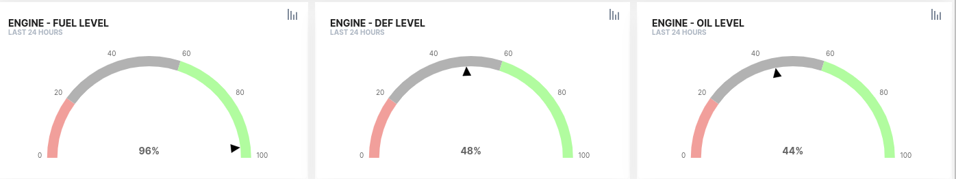
A check on all consumable levels that are needed to operate the machine: fuel, DEF, oil, battery state of charge, etc.
-
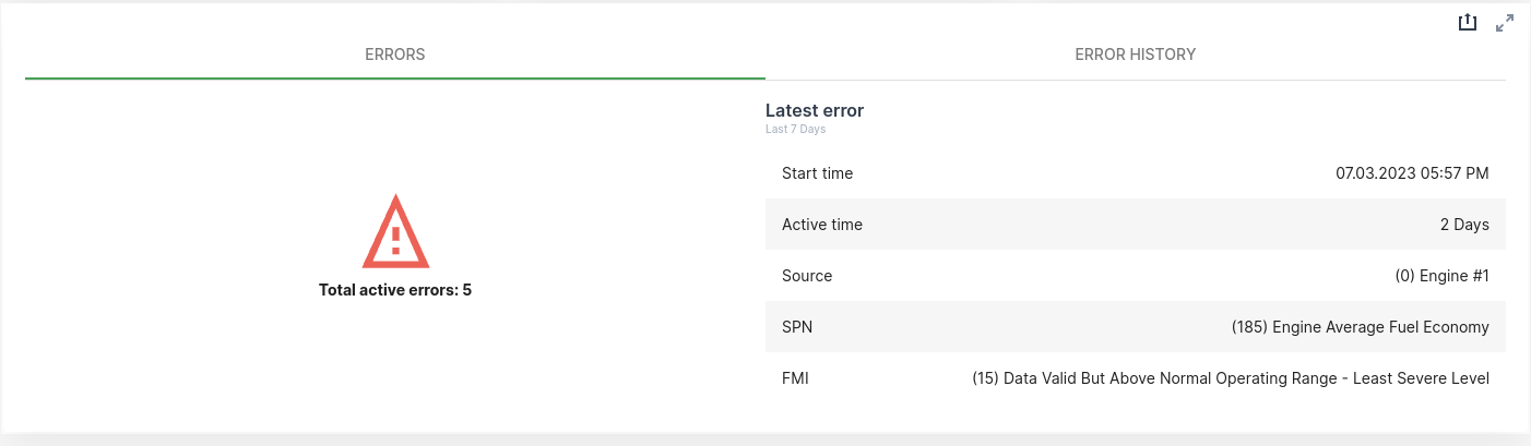
Any active problem with the machine: lamps, trouble codes, etc.
-
Upcoming or overdue scheduled maintenance.
-
Even if you are able to craft a good visualization of all the information of importance to machine owners, bear in mind that most of these users reach the portal to complete the simple tasks of checking the machine’s health and looking at its recent activity. They want to achieve this goal fast and therefore they will appreciate simple and intuitive data visualizations instead of feature-rich or complex ones. That is why we always recommend keeping things simple and self-explanatory.
3. Working with Machine Details Pages
3.1. Organizing Layouts
We recommend organizing content by:
-
Audience
The DataPortal allows you to organize users and machines into organizational units structured as a tree. This helps you reflect your company’s organizational structure and manage the visibility and access to machines.
It also has the concept of Organization Types. Organization types allow you to qualify an organizational unit in your tree indicating if it is part of your company (OEM type), if it is part of your dealership network (Dealer type), or it is one of your end customers (Machine Owner).
As you can see, the concept of organization types is pretty much aligned with user audiences in the portal. We recommend creating different Dashboards and Machine Page pages for each of these audiences.
In the DataPortal, go to Settings > Administration > Organization Structure and check your organizational tree now to ensure that every organizational unit is well-qualified with the right organization type. -
Topic
As we have seen, the machine owners are interested in two topics: machine health and recent activity. But this can be further broken down into a complete taxonomy of topics, see following topics.
We recommend that you create one page layout for each of two bigger topics, activity and health. Then use the suggested taxonomy to organize widgets in the layout.
Depending on the amount signals you use in your fleet to represent each of these topics, consider moving out lower level topics to their own layout.
-
Machine activity
-
Location & Tracking
Current location of the machine and its recent track
-
Work Delivered
Amount of work delivered in business meaningful units. Depending on the asset type this can take different forms. For example, for an excavator this could be expressed with Total load count and Total weight loaded.
-
Consumption
The amount of different consumables used. Consider Fuel level, Battery level, AdBlue level and similar signals.
-
-
Machine Health
-
Faults
Active DTCs and history of DTCs.
-
Consumable Levels
Levels of different consumables needed to operate the machine.
-
Scheduled Maintenance
Upcoming and overdue maintenance that might put the machine at risk if not serviced in time. If you have the maintenance feature enabled, this is directly supported by the machine master data widget that shows whether a machine needs maintenance.
 Figure 1. Maintenance icon
If you are not using the DataPortal’s maintenance feature you might be using signals like Hours to next service.
-
Operational Safety
Any signal reflecting different aspects of use of the machine that are critical to its operational safety. For example, Engine oil temperature, Engine speed, Machine speed, Tilt angle, Engine load, etc.
-
-
-
Time Range
Currently, you have to configure the time range applied to data visualization on a widget-per-widget basis. This means you could mix data visualizations for completely different time ranges on the same layout. This would be confusing for the user.
We encourage you to create layouts where all widgets are configured for the same time range.
With the release of the Machine Details Page by Organization Type feature, now you can easily organize your machine details pages by audience and topic. If you don’t have yet access to this feature, please contact support to get access.
A sample setup for machine owner targeted machine detail pages could be as follows:
-
A home layout with the machine activity for the last 7 days.
-
An alternative layout with the machine activity for the last 30 days.
-
An alternative layout with the health status of the machine.
3.2. Use colors consistently
Use a limited palette of colors and apply them consistently across data visualizations in different widgets so that users can easily understand what is being represented.
Colors can be used to:
-
Identify signals
We can aim to always display a signal with the same color so that it is easily identifiable in different data visualizations. The main problem with this approach is that as the number of signals displayed grows, the number of colors needed grows with the signals. And you can end with a large palette of colors that does not offer sufficient contrast between colors as to tell one color from another and use them for visually identifying signals.
-
Convey meaning
Another approach is using color to add semantics to data visualization. Think of stoplights. They use red, green, and yellow colors to express stop, move on, and a changing situation between “stop” and “move on” respectively.
-
Approach 1: "Health"
You can use a very limited set of colors, such as green, red, and grey to express a healthy situation, an unhealthy situation, and a neutral situation respectively.
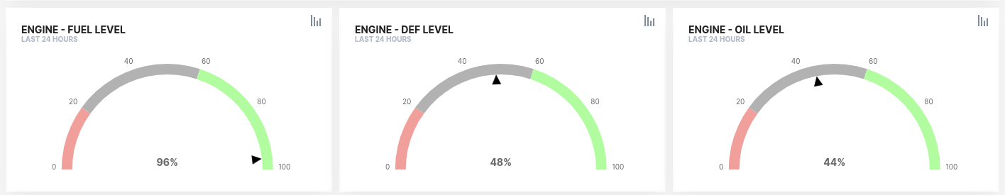 Figure 2. "Health" colors
 -
Approach 2: "Maximum, Minimum, and Average"
Use the same color palette of green, red, and grey to express minimum value, maximum value, average value, and current value respectively.
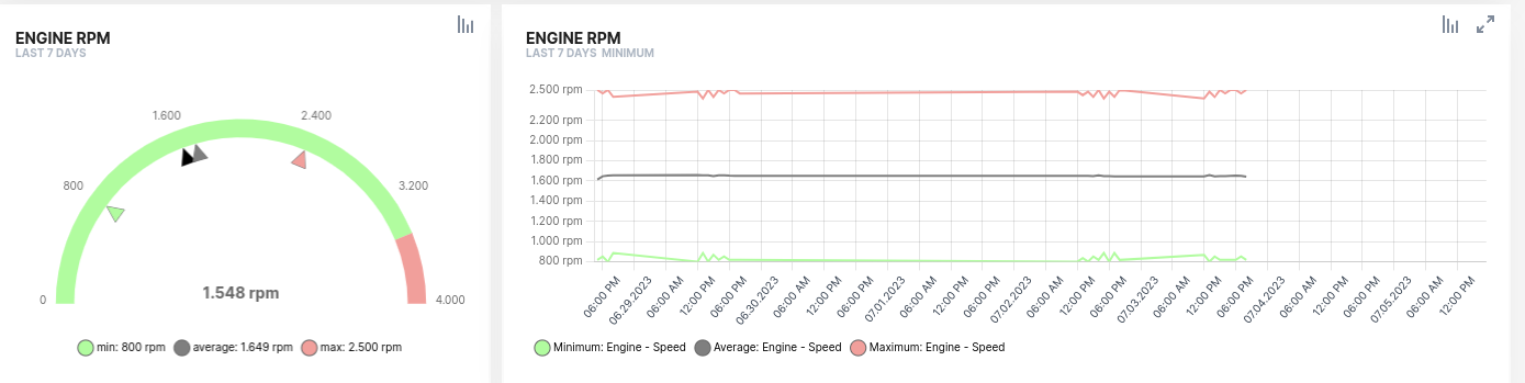 Figure 3. "Maximum, Minimum, and Average" colors
 -
Approach 3: "Current value"
Use a high-contrast color, such as black, to represent the current value.
-
Though the semantics of colors change from approach 1 to approach 2, they can be well understood depending on the context. If this is not convenient for you, consider using different shades of red, green, and grey when expressing health and expressing maximum, minimum, and average values.
From the two possible uses of color described here, we recommend using colors to convey meaning because it is more expressive and limits the number of colors used making information more readable.
3.3. Keep the Layout Cohesive & Beautiful
When laying out the widget in the canvas, make it in a way that is:
3.3.1. Cohesive
-
Related aspects of the machine should be organized together. We suggest you organize widgets by signal or topic.
In this context a topic is driven by related signals, maybe looking at different data on the same machine component. For example, the engine topic could be expressed with engine state, engine speed, and engine temperature signals. We already mentioned that a subtopic of activity monitoring could be billing and accounting, so grouping widgets bearing information on all billable aspects of a machine, like operating hours and consumables, would also make sense.
-
Add a divider to categorize blocks of content
3.4. Simplify Visualizations
The Data Portal is extensive in features and capabilities which gives you a lot of flexibility and power in how you visualize data. You may be tempted to use many different visualizations that provide sophisticated ways to represent the data. Or you may want to mix different signals into a visualization. This may play well for your internal OEM audience, but not for machine owners.
Machine owners are interested in a limited set of machine data and they don’t have much time to spend understanding it. They not only need to understand the data that is being visualized but also the visualization used (plot, gauge, heat map, etc…). The more signals you use in a layout and the more visualization you apply to those signals, the more complex it will be for the user to understand the machine data. Therefore, we recommend to:
-
Reduce the number of different widgets and their visualization options used in your layouts
Keep the widget types and visualizations used limited. Once you find a nice widget configuration to represent some category of signals use it consistently for all those signals.
-
Use only one signal per widget
In general, we recommend simplifying visualizations for machine owners by reducing the number of signals in a single widget.
You can certainly use many signals in a single widget but this will make the visualization more complex, especially if signals use different units and the widget needs to show different unit scales on the axes of the plot.
In some cases, it might make sense to show two signals in a single widget to reflect their correlation. For example, operating hours with fuel consumed, distance traveled with fuel consumed, or load count with total weight handled. Nevertheless, you can express the same correlations by using one signal per widget but placing the related widgets together.
Remember, less is better.
3.5. Organizing Widgets in a Layout
Make the layout look compact and where possible align widgets.
3.5.1. Horizontally aligning by Topic or Signal
For example, the following row is all about engine speed measured in RPMs. Two different widgets provide visualizations on the same signal.
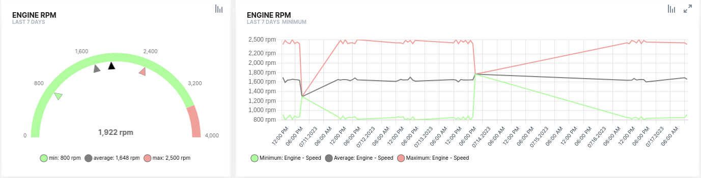
The one on the left provides an aggregate view of the maximum, minimum, average, and current values of the engine speed for the last 24 hours time frame. This gives the user the possibility of identifying misuse in the last few hours.
The one on the right provides the full history of the maximum, minimum, and average values of the engine speed hour by hour. If misuse actually took place, this allows the user to drill down further and see if the misuse was something accidental or continued in time and when it happened.
3.5.2. Vertically aligning by Visualization Pattern
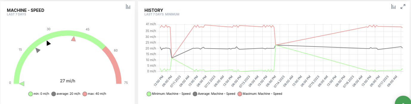
Many times, you will find a nice set of visualizations to look into some signal or topic. Then you may want to apply the same set of visualizations to other signals of similar nature. This is what we call a pattern that can be reused across layouts and applied to different signals.
For example, the following two rows use the same structure introduced above to visualize two signals: engine speed in the upper row and machine speed in the lower row. The visualizations chosen to look at the two different signals are exactly the same. Once a user understands the story told by the first row, he can also apply the same pattern to understand the story told by the second row. This significantly decreases the cognitive load of the user and makes layouts easier to understand.
3.6. Let the User Drill Down
Widgets serve as entry points for reports.
Users can click the report icon on any widget and directly navigate to a preconfigured report that they will be able to further customize to their needs. Also, reports are the only way a user can export their machine data for use in their email workflows, billing, and other business activities.
Enable reports for the machine owner user. It is the only way they can drill down into their machine data and export it for sharing beyond the Data Portal.
4. Sample Template for an MO-oriented Machine Details Page
Here we provide a sample template for a machine details page visualizing the most common data across OEMs and industries that are of interest to a machine owner.
4.1. A Foreword on Standard Signals
Proemion recommends a set of Standard Metrics with specific semantics, this is that all stakeholders understand the meaning of the signal, what it represents, and the units with which it expresses a magnitude.
For example, many moving machines track the total distance traveled. If you chose to name such signal as distance_traveled and express it in leagues, which is not a standard unit in the metric or imperial systems, you are going to have your metric delivered into the DataPortal but this will prevent your users from benefiting from things like:
-
Selecting their preferred unit system, metric or imperial, and getting the value in their preferred flavor.
-
Deliver cumulative distance traveled data in an ISO 15143-3 (AEMP) compliant format.
-
Using this metric in the Machine Companion mobile app, see Machine Companion App (Google Play).
If you used the value.common.machine.distance.total signal key to name your signal and used the length.KILOMETER unit to express its magnitude as well as the counter signal type (see PDC Value Definition), the platform will be able to:
-
Support this signal automatically in the Machine Companion app
-
The portal will be able to represent the values in different units in the two supported unit systems making conversions automatically available
-
If a user wants to export their machine data via our Proemion AEMP API Documentation, this signal will be immediately available to them without additional configuration effort.
What we want to illustrate here is that:
-
Many DataPortal features rely on the use of standard signals
-
Using standard signals allows you to benefit from new features as they make it live without additional configuration effort
In this guide, we are using a subset of the standard signals that apply to most machines across different industries to illustrate a minimal configuration for your machine details pages focusing on the interests of a machine owner.
The subset of signals we will be using in this guide is the following
-
Location (Degrees)
-
value.common.machine.geo.latitude -
value.common.machine.geo.`longitude
-
-
Fault codes
-
value.common.machine.caution.code -
value.common.machine.diagnostic.trouble.code
-
-
The total distance traveled (Kilometers)
-
value.common.machine.distance
-
-
Total operating hours (Hours)
-
value.common.machine.hours.operation.total
-
-
Total number of loads the number of loads
For example, for earth moving machines or elevator platforms-
value.common.machine.load.count.total
-
-
Total amount of weight loaded (Kilograms)
-
value.common.machine.load.total
-
-
Current diesel exhaust fluid level
-
value.common.engine.def.level
-
-
Current fuel level
-
value.common.engine.fuel.level
-
-
Current oil level
-
value.common.engine.oil.level
-
-
Total fuel used (Liters)
-
value.common.engine.fuel.used.total
-
-
Machine speed (Kilometers per hour)
-
value.common.machine.speed
-
-
Engine speed (Revolutions per minute)
-
value.common.engine.speed
-
|
In the DataPortal, go to Settings > Machine Data Management > Signal Catalog and check how many of the standard signals are you covering. You don’t need to cover all the standard signals, but if you cover a few of the core signals listed in the list above you will be able to unlock most of the potential of the platform. |
5. Structure of the Sample Template
The following template is structured in the two different machine page layouts, each focused on one of the main topics of interest to the machine owner: machine activity and machine health.
Each layout is using the taxonomy suggested in the Organizing Layouts section.
The different elements of the sample template are presented starting with the questions the machine owner is trying to answer and then showing the data visualization the best serves as means to respond that question.
5.1. Sample Template for an MO-oriented Machine Details Page
5.1.1. Activity Topic
Location
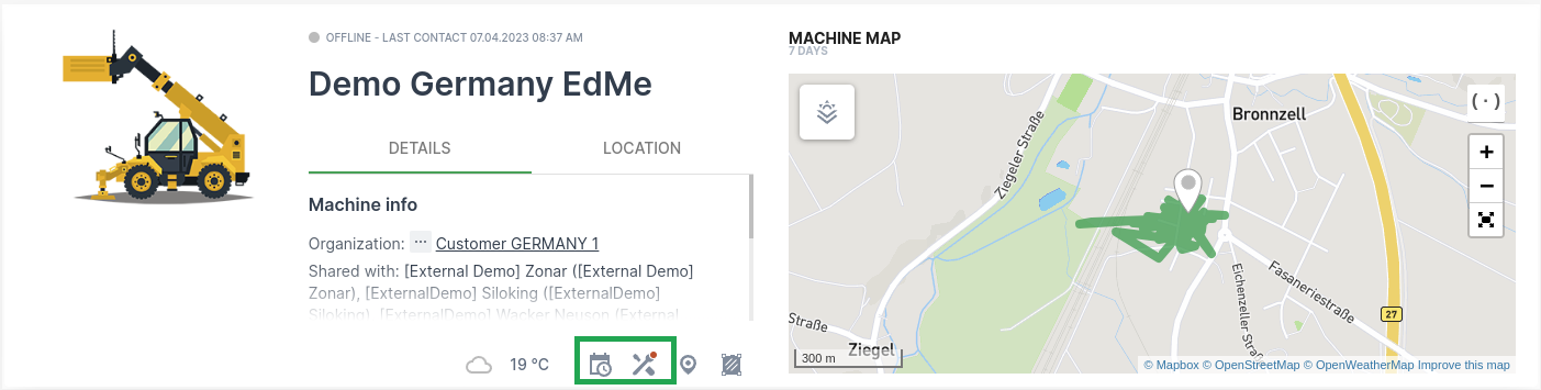
 Where is my machine today? Does it have any scheduled maintenance?
Work
What has the machine been doing so far in the last 7 days? How much work has it delivered in hours each day?
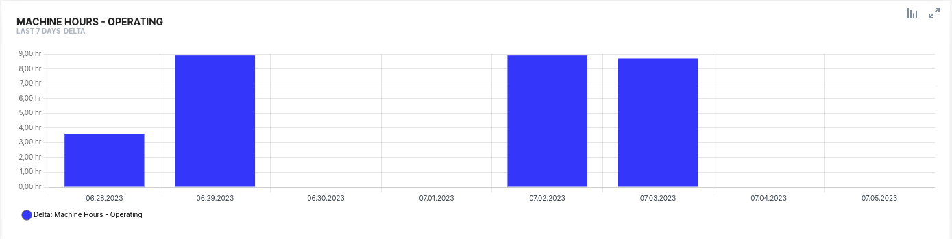
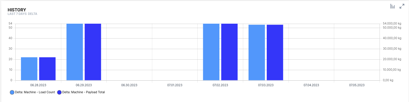
The amount of work delivered by a machine depends on the asset type of the machine. As an example, consider an earth moving machine that delivers Total load count and Total weight loaded signals. Notice that here we are using the two signals in a single widget to show correlation, but this could also be perfectly reflected in a simpler way by plotting the two signals in their own widget with both widgets vertically aligned.
How much work has it delivered in the number of loads and weight handled each day?
5.1.2. Health Topic
Maintenance
Where is my machine today? Does it have any scheduled maintenance?
If you have the maintenance feature enabled the machine master data widget already provides access to the maintenance topic out of the box.
If you are not using the maintenance feature, consider adding the latest value to a signal representing Hours to next service or a state signal indicating if Machine needs maintenance.
Operational Safety
Following are two examples of how to represent proper use of the machine within a recommended range of operation.
The first example looks at engine revolutions per minute and shows:
-
On the left, are the Max, Min, Average, and Current values in the last 7 days. Tells the user if the machine was operated beyond the recommended threshold anytime in the last 7 days.
-
On the right, is the history of the Max, Min, and Average values. If the machine was operated beyond the recommended range, the user could see in this graph if this happened one or more times, and when these violations took place.
Is the engine being operated according to the OEM’s recommendations?
Is my machine driven at speeds within the legal and safety recommendations?
The second uses the same visualization as the previous one but on the machine speed data. This tells the user if the machine was driven at speeds beyond those recommended. Also, it illustrates the case for reusing visualization patterns, see Vertically aligning by Visualization Pattern.
6. Service and Support
The latest versions of the drivers, software, firmware, and documentation are available in our Document Library.
Do you need help or want to report a bug?
Visit Proemion for more information, or raise a ticket at Support.
6.1. Firmware Updates and Support
|
Version: 11.0.988